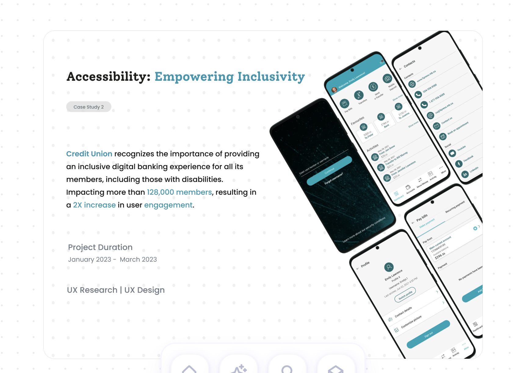
connectFirst is the largest credit union in Alberta. Some of its members couldn't use the app on their own because of a visual or hearing impairment. I set out to fix that without changing the look and feel members already knew.

Overview
connectFirst has 40 branches across central and southern Alberta and more than 125,000 members. Its community focus is a big part of why people bank there, and the app didn't live up to it for members with disabilities.
The project started with feedback from those members. The goal was to make the app work with screen readers and other assistive technology, and to meet WCAG, while keeping the existing look and feel.

The brief
We designed for people with visual, auditory, motor and cognitive impairments. They wanted to manage their money on their own, with clear navigation, strong contrast and support for the assistive tools they already use. For the credit union, it was a chance to serve more of its community, meet regulatory standards and earn more loyalty from members.

Process
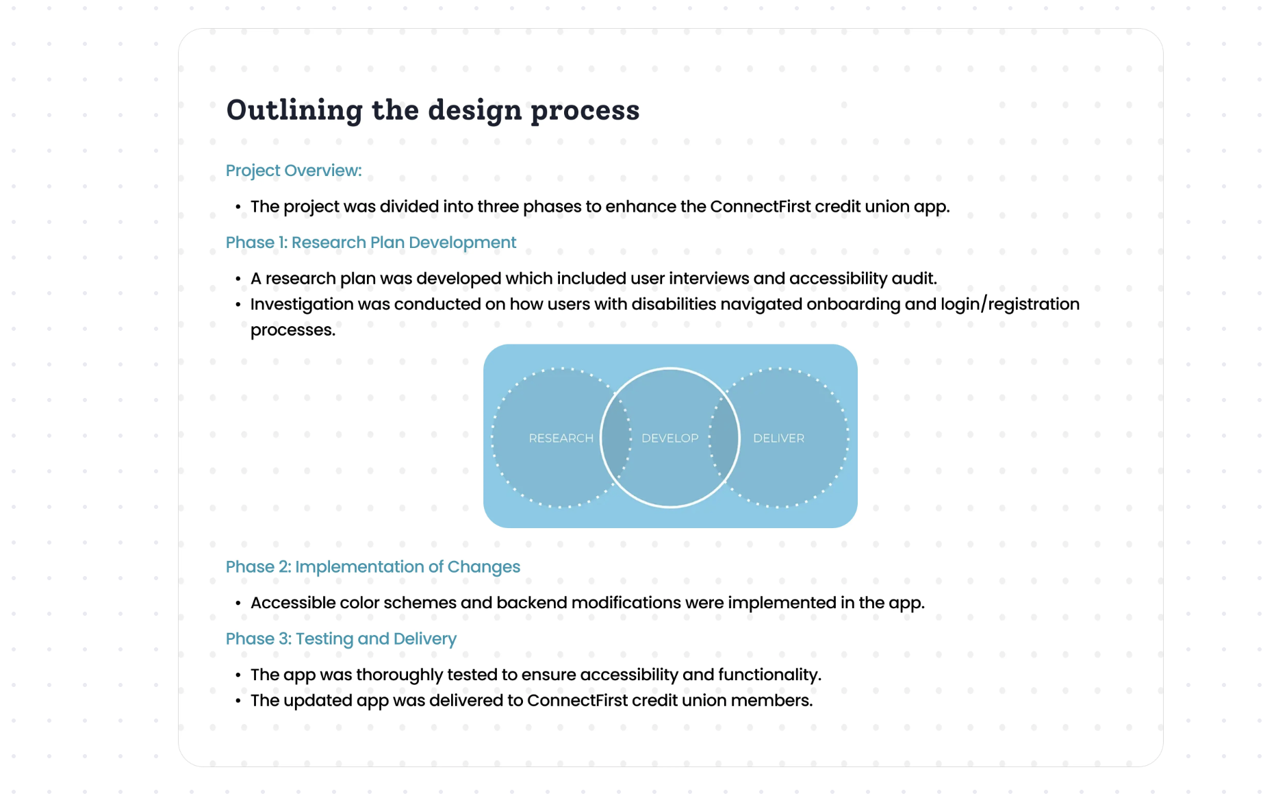
We split the work into three phases. First, a research plan with interviews and an accessibility audit, looking closely at how people with disabilities got through onboarding and sign-in. Then accessible colours and the code changes behind them. Finally, careful testing before the update went out to members.

01 · Research
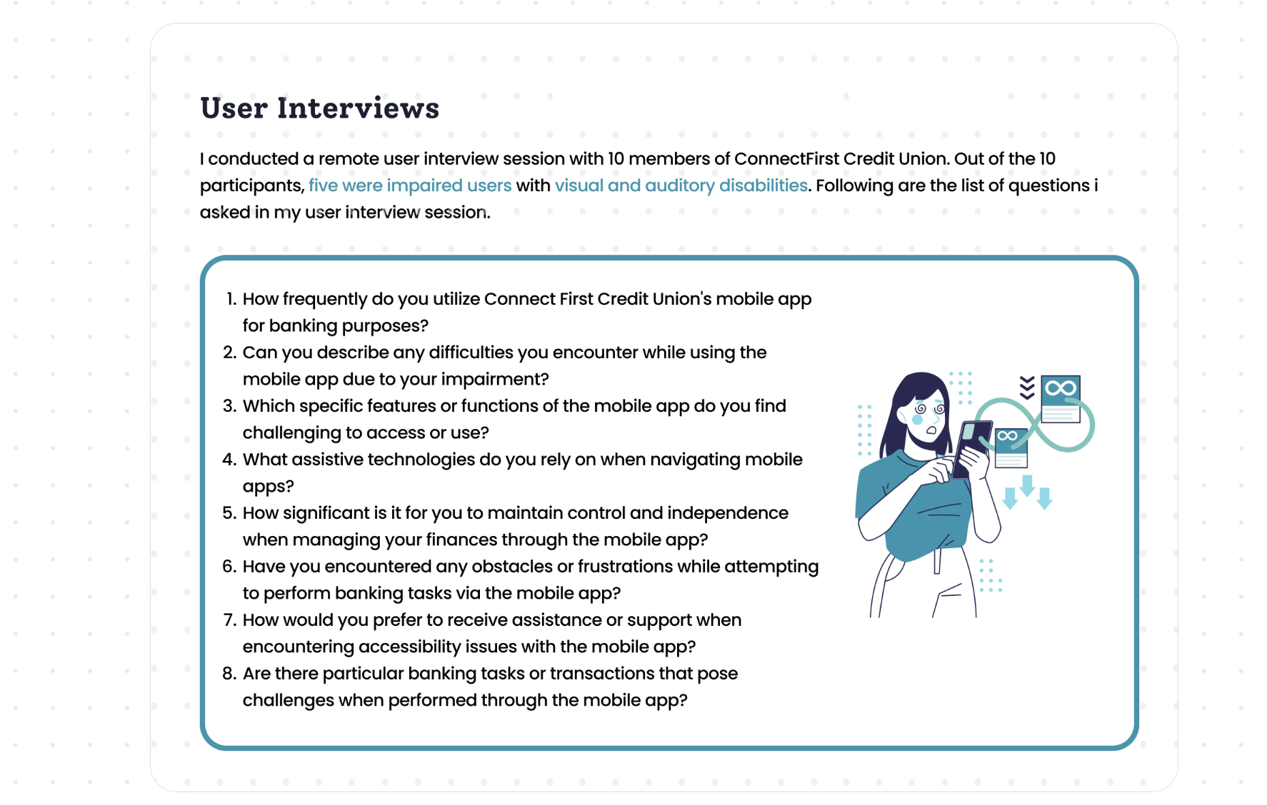
I ran remote interviews with 10 connectFirst members. Five of them had visual or hearing disabilities. I asked how often they banked in the app, what got in their way, which assistive tools they used, and how much it mattered to them to manage their money without help.

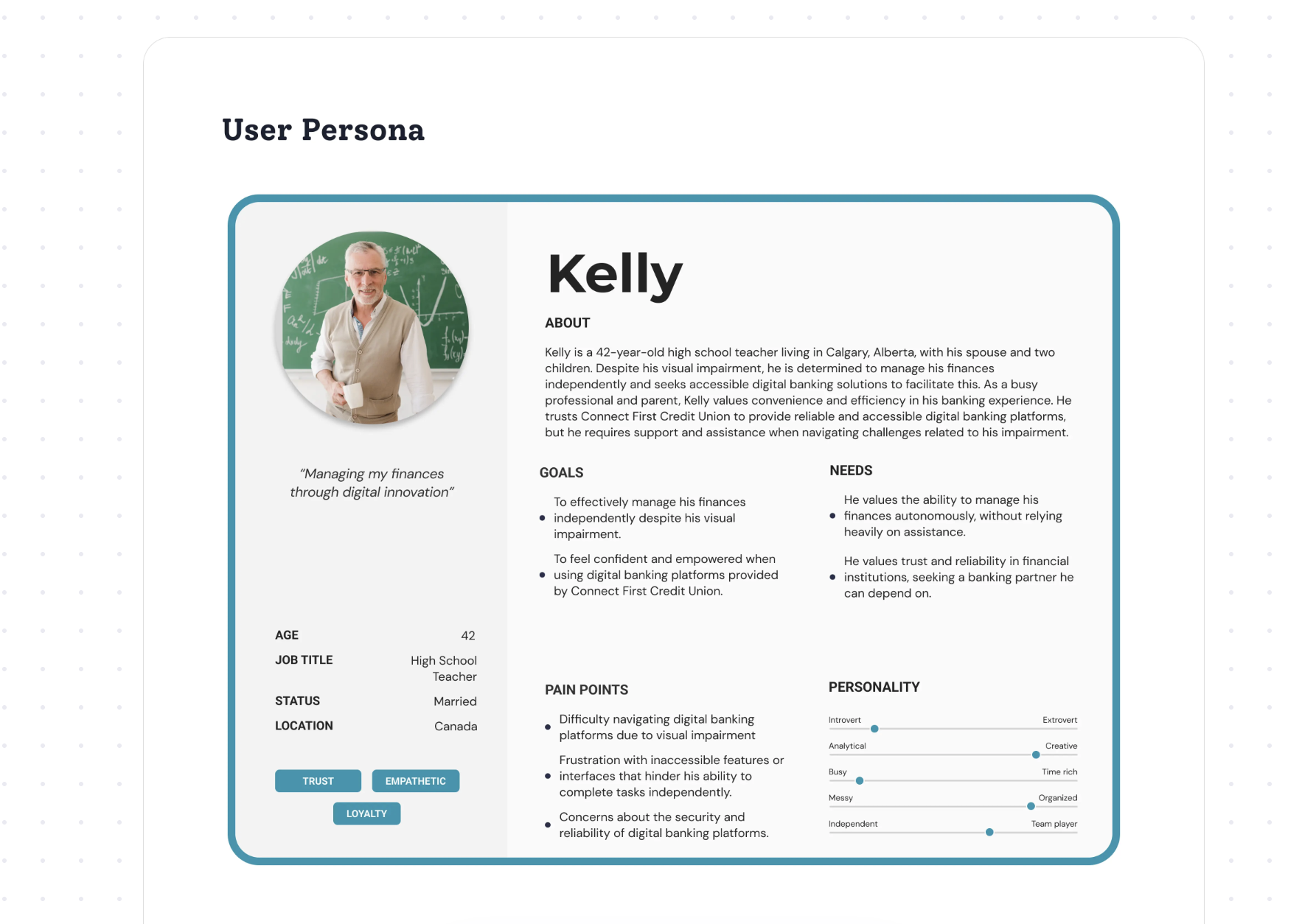
Kelly brought together what we heard. He's a high school teacher in Calgary with a visual impairment, a spouse and two kids. He wants to handle his own finances, and he gets frustrated when the app makes him ask for help.

02 · Audit
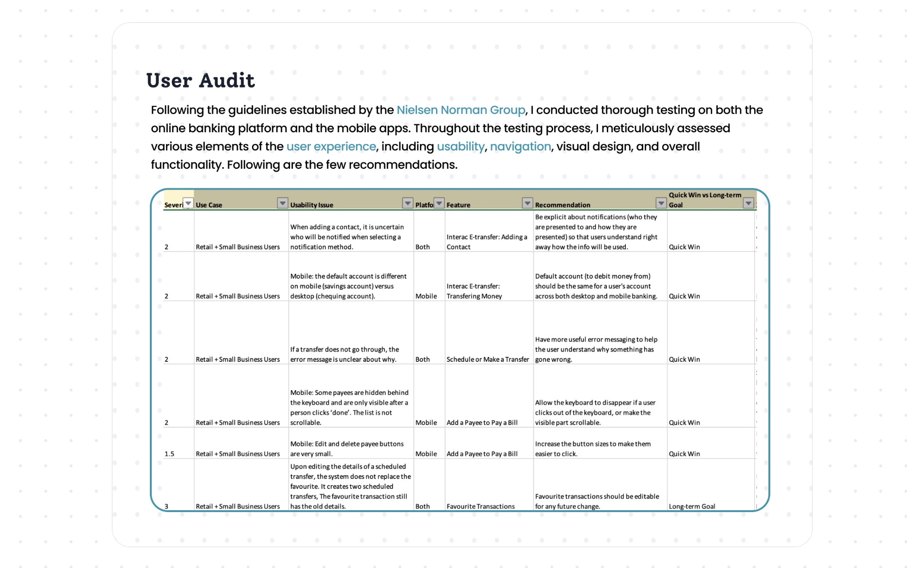
Following Nielsen Norman Group guidelines, I tested the online banking site and both mobile apps, looking at usability, navigation, visual design and how everything worked. Each issue got a severity rating, a recommendation, and a label saying whether it was a quick win or a longer-term goal.

03 · Design
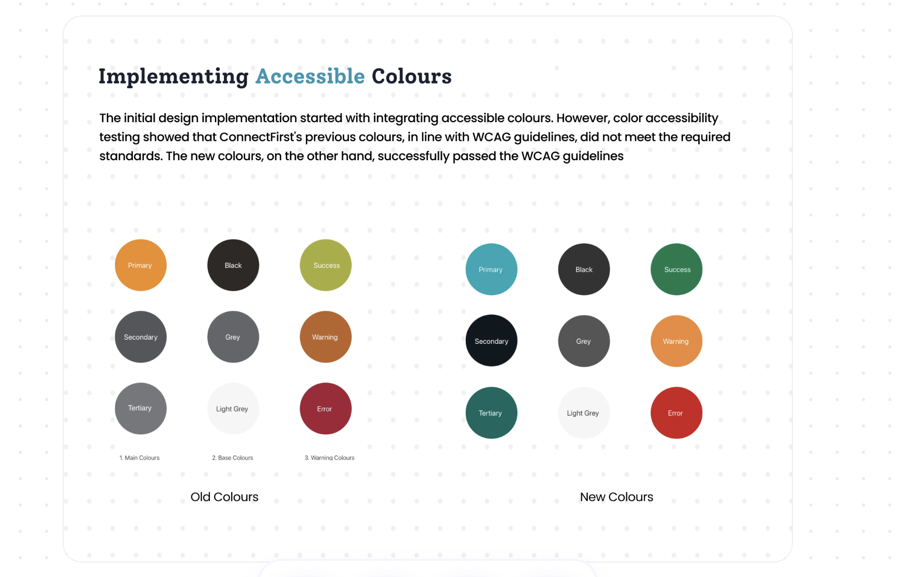
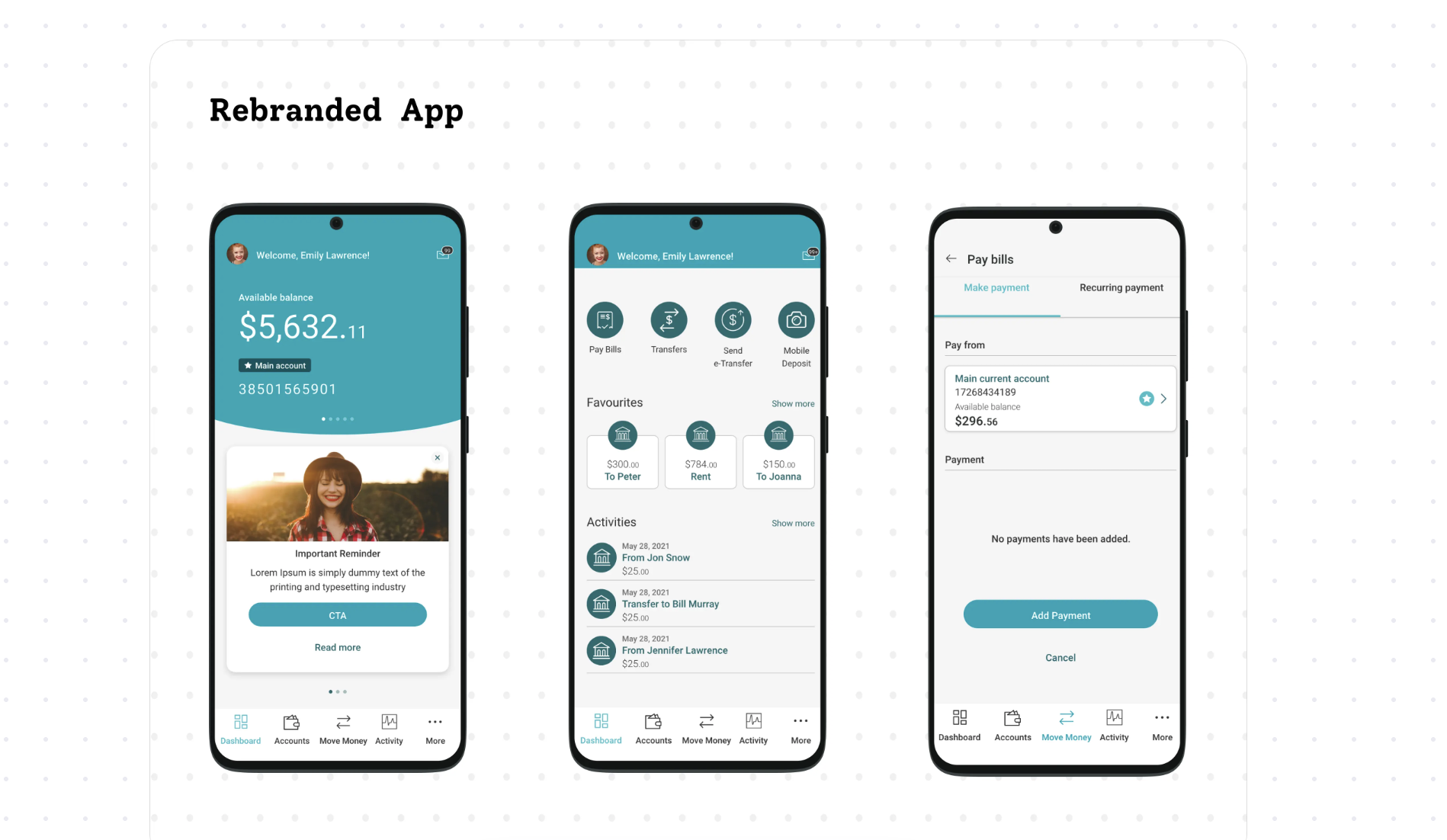
We started with colour. Contrast testing showed that connectFirst's existing palette didn't meet WCAG, so I proposed a new set that did, while keeping the brand recognisable.


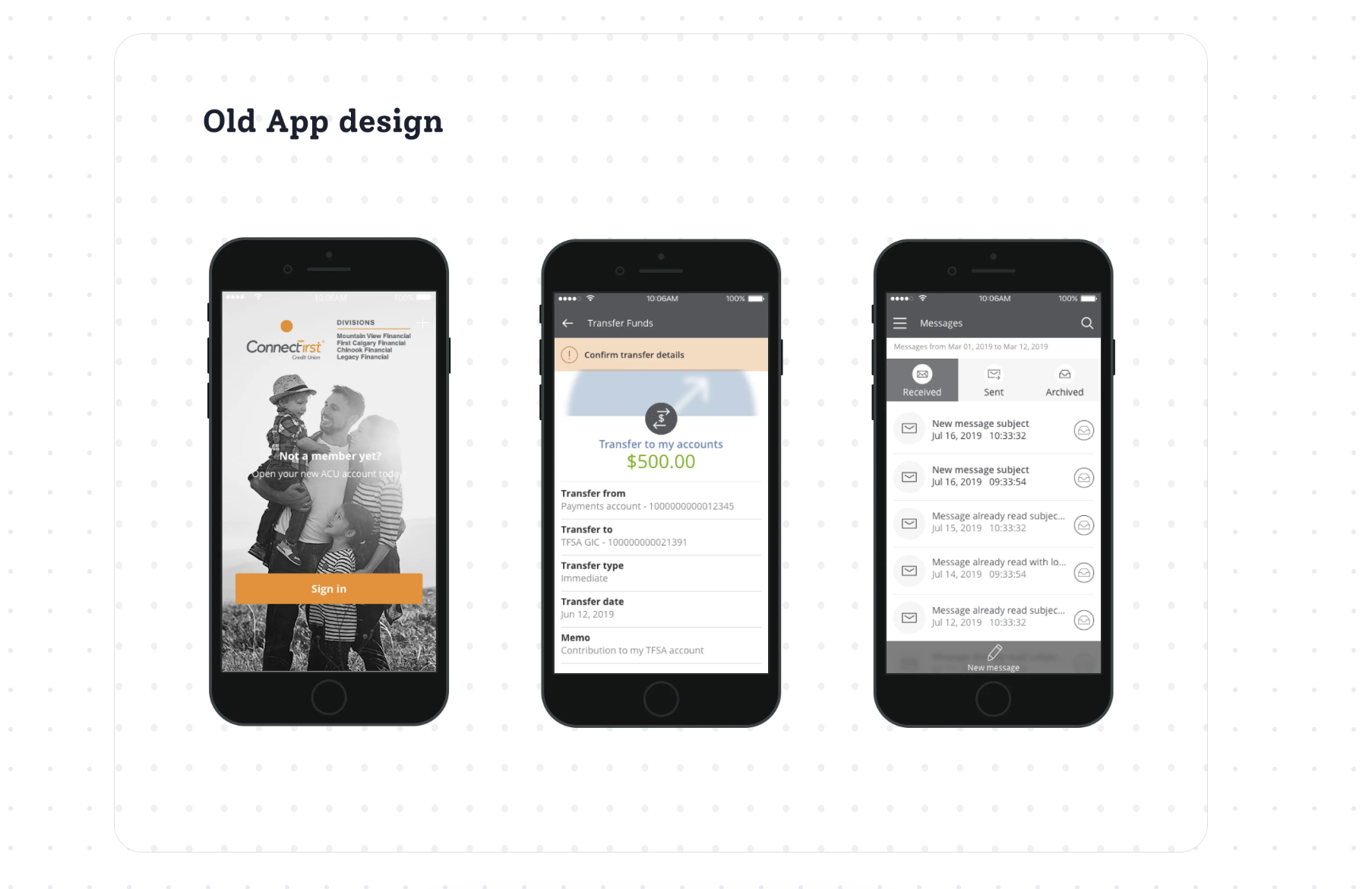
04 · Before and after


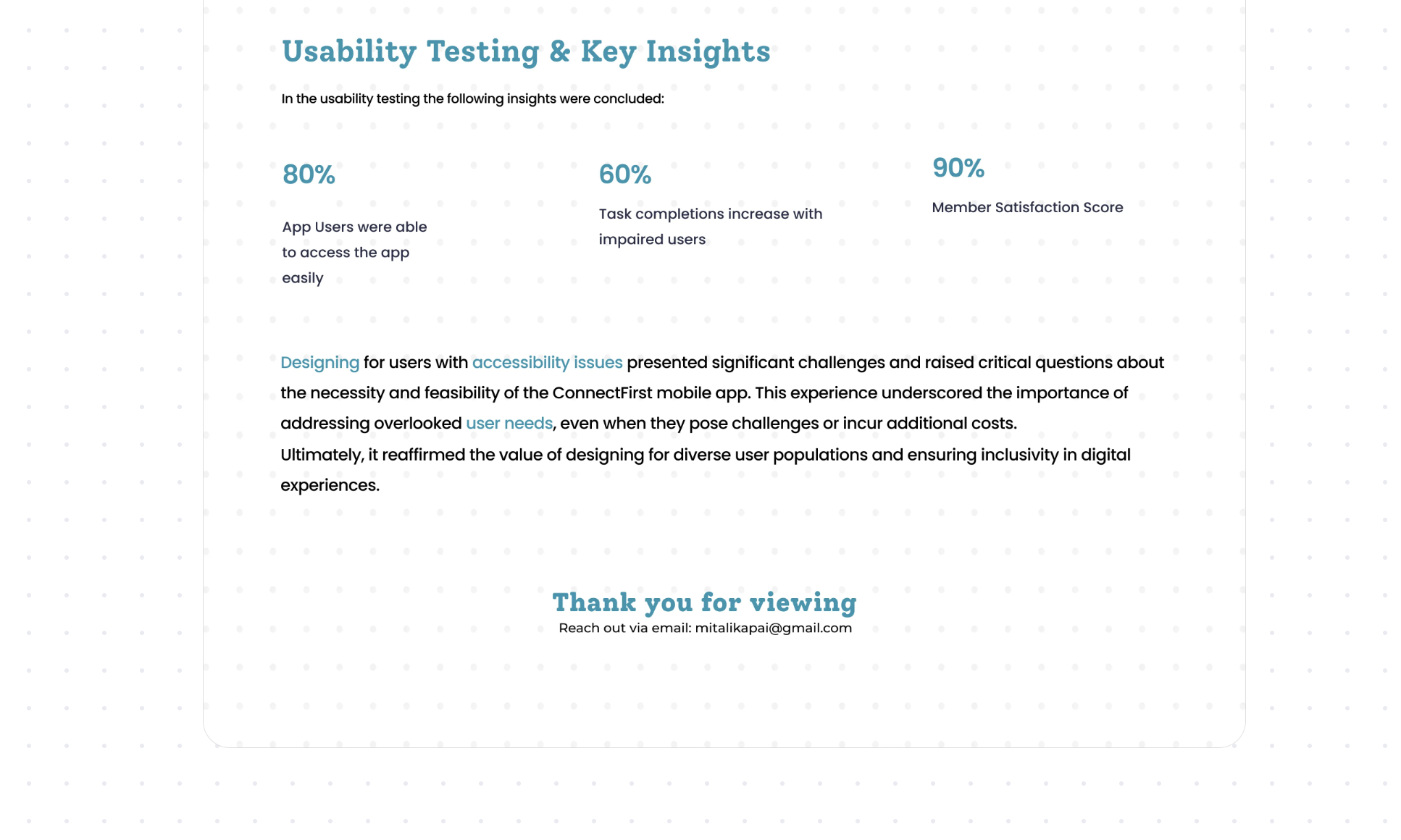
Testing & impact
Designing for members with disabilities raised real questions about cost and effort. It also showed how much a team misses when it doesn't design for everyone. I'd make the same call again.