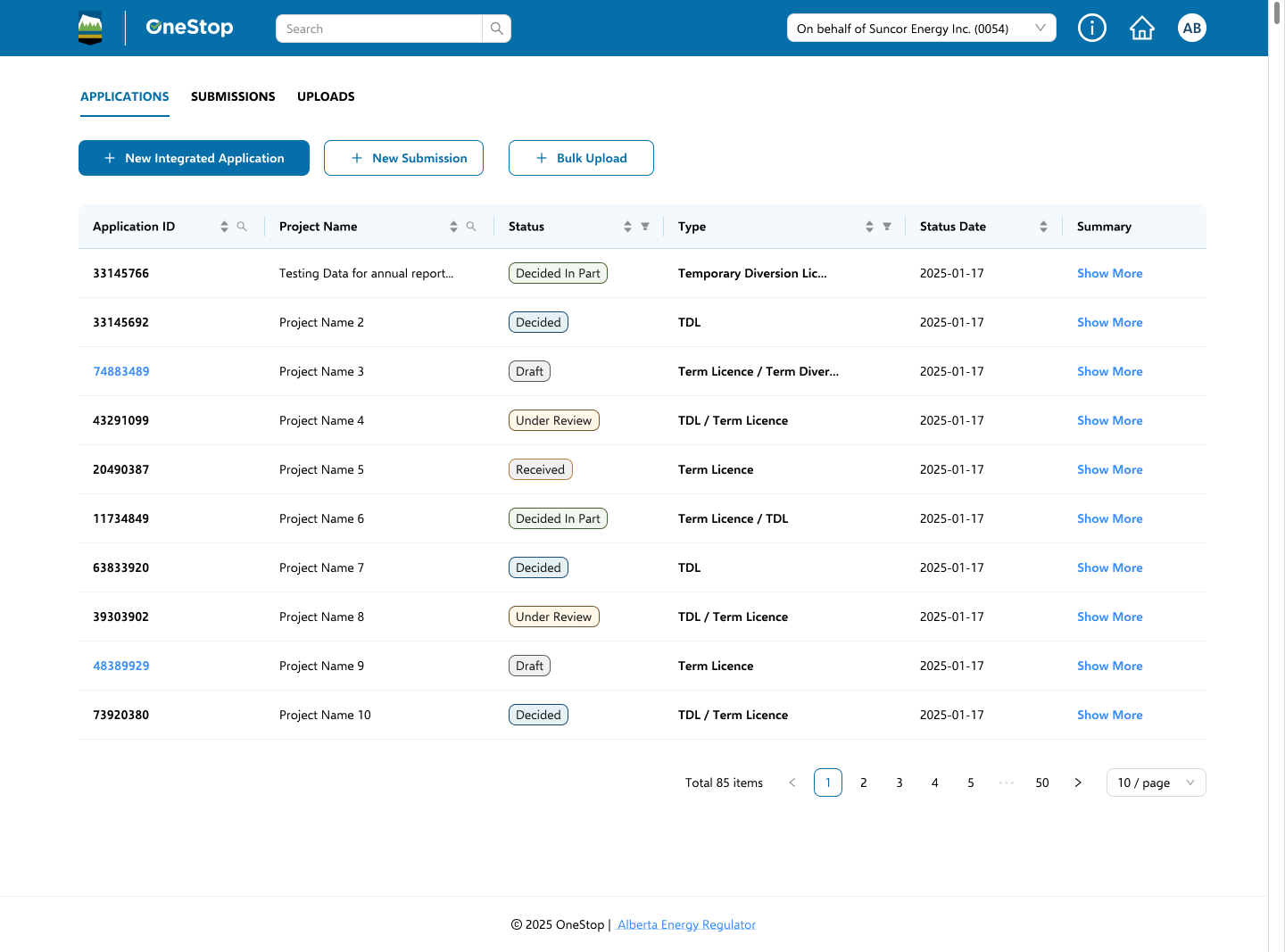
OneStop is the Alberta Energy Regulator's platform for energy and water applications. I mapped how it fit together, designed the flows, built and looked after the design system, and worked with engineering as product owner to get it shipped. The goal was easy to say and hard to do: one consistent, accessible product for two very different groups of people.
Context
The Alberta Energy Regulator oversees energy and water development in the province. Companies use OneStop to apply for, change, renew and cancel licences. AER staff use the same system to review those applications and make decisions on them.
OneStop 2.0 was the rebuild. It had to work for two groups with almost opposite needs: operators filling in long, technical applications, and reviewers working through a queue of them every day.
When I joined, the product had been growing for years without a shared foundation. It worked, but it didn't feel like one product. Each flow did the same things in its own slightly different way.
The challenge
The visual design was the easy part. In a regulatory system, a confusing form can lead to an incorrect filing, so inconsistency carried real risk.
Tables, forms, modals and wizards had been rebuilt dozens of times. Each one was a little different, and none of them were documented.
Operators needed guidance and room to make mistakes. Reviewers needed dense screens they could move through quickly. Both used the same screens.
Many fields were tied to legislation or water-volume calculations. A mislabelled input could turn into a compliance issue.
With nothing shared, a small policy change could spread across many screens and take weeks to rebuild.
Focus order, labels and contrast changed from flow to flow. For a public government service, that's a real barrier.
Designs lived in scattered files and engineers interpreted each one on their own, so things slowly drifted apart.
My role
I joined as a senior UX consultant and gradually took on more of the product. These roles overlapped all the time, and a lot of the value came from one person holding all of them.
I worked out how the platform fit together: how applications, submissions and authorizations relate, how people move between them, and the dynamic-forms engine behind every flow.
I designed all 60+ flows end to end, including the parts that are easy to skip, like empty states, errors, bulk upload and edge cases.
I built the design system and its tokens, kept it up to date, and set up a way for other teams to add to it without splitting it apart.
I ran the backlog and roadmap, wrote specs, and worked closely with engineers during the build so what shipped matched both the design and the policy.
Research & analysis
Before designing anything, I talked to both groups of users, went through every flow, and sat down with policy experts to understand the rules behind the fields.
| Sev | Flow | Issue |
|---|---|---|
| 3 | Water Term Licence | Volume units inconsistent across steps |
| 2 | Amendment | Unclear what a change replaces |
| 2 | Pay / Submit | Error message doesn't say why |
| 1 | Bulk upload | No progress feedback on large files |
| 1 | Review queue | Filters reset on navigation |
The same theme kept coming up. People were being asked to keep track of things in their heads that the interface should have handled for them.
Architecture
What made it manageable was treating OneStop as a set of shared layers instead of 60 separate products.
In the middle of it all is a dynamic-forms engine. Every flow is built from the same form pieces, validation rules and review pattern, so when legislation changes, the team updates configuration instead of writing new code.
The screens
The Water Term Licence is one of the most complex applications in OneStop. It has many steps, lots of documents and real water-volume calculations. My thinking was that if the system held up here, it would hold up anywhere.
The design system
Tokens at the bottom, 180+ documented components on top, and a clear process for adding to it so it stays consistent as it grows. Everything in this section is live, pulled from the real stylesheet rather than screenshots.
The blue scale isn't a simple light-to-dark ramp. 600 is the main brand blue for headers and page chrome, and 800 is for links, active states and focus. Mixing them up is the quickest way to make a screen look off-brand.
| Token | Value | Contrast |
|---|---|---|
color.brand.navy | #18496D | AA · 8.6:1 |
color.action.primary | #066EA8 | AA · 4.9:1 |
color.status.success | #639144 | AA · 4.6:1 |
color.surface.info | #E6F1F6 | — |
Selawik is used everywhere. It's open source and spaced like Segoe UI. Roboto handles numbers, because authorization IDs need to line up neatly in table columns.
Every component was documented in all of its states, including the ones people tend to forget.
Accessibility
For a government regulator, accessibility is a legal requirement and simply the right thing to do. Instead of fixing 60+ flows one at a time, I built WCAG 2.1 AA into the components themselves, so every flow got it automatically.
Every text and background pairing was checked against AA before it shipped.
A clear, consistent focus order through every multi-step flow.
Names and descriptions documented for each component.
Why I made these calls
Most of the work above came down to a handful of choices. Here's what I chose and why.
If the components could handle the Water Term Licence, the simpler flows would mostly follow. Starting with an easy one would have hidden the problems until later, when they cost more to fix.
Sixty flows was too many to fix one at a time, and fixes made that way drift apart again. Fixing the shared pieces once meant every flow got better together.
Legislation changes. I didn't want every policy update to become a design and development project. Keeping the rules in configuration makes those changes smaller and safer.
Checking 60 flows by hand every release isn't realistic. When it lives in the components, teams get it right by default, even if they aren't accessibility specialists.
The audit showed people losing work and doing calculations on the side. Both are easy for software and stressful for people, so the interface should handle them.
Instead of designing two apps, I tuned the same components: more guidance for operators, more density for reviewers. One system to maintain, two experiences that fit.
Design decisions kept getting lost between Figma and code. Owning the backlog and working with engineering day to day meant tradeoffs got made in the room, not after release.
The tradeoff: building shared pieces first is slower at the start. With 60 flows still to go, I thought that was worth it.
Outcome
In moderated usability testing, the rebuilt submission flows led to fewer task errors and smoother work for operators. The bigger change was in how the team works. Policy updates now go through configuration and shared components instead of one-off rebuilds, so AER can ship faster, and consistency and accessibility come built in.
Once the table, the form and the wizard are solved properly, and someone owns them, teams can spend their time on the regulation instead of rebuilding the same screens. — What I took away from OneStop 2.0
Looking back
Regulators can't hand applicant data to an AI tool, and they shouldn't. That rules out the obvious uses. But a lot of this project's slowest work didn't need any sensitive data at all.
Legislation is public. Design files, component specs and audit notes aren't personal data. Test data can be made up. That's where I'd use AI if I did this again: on the work around the data, not the data itself.
| Task | How AI could help | What it needs |
|---|---|---|
| Plain-language copy | Turn legal wording into help text and error messages people can actually follow | Public legislation |
| Auditing 60+ flows | Compare screens and flag inconsistent tables, forms and labels before a person reviews them | Design files |
| Accessibility checks | Catch contrast problems, missing labels and focus order issues across every flow | Design files, code |
| Research synthesis | Group interview notes into themes once names and identifying details are removed | De-identified notes |
| Test and prototype data | Generate realistic but fake licences, volumes and well points for prototypes and testing | Nothing real |
| Component docs and specs | Draft usage notes, states and hand-off specs from the design system | Design system |
| Prototyping | Build clickable prototypes from the real components, so ideas get tested in days, not weeks | Design system |