Banking without barriers.
An accessibility overhaul of a digital banking app used by 125,000+ members — rebuilding colour, contrast and screen-reader support to WCAG, while keeping the brand's familiar look and feel. The result: a 2× lift in engagement and 30% fewer accessibility support calls.
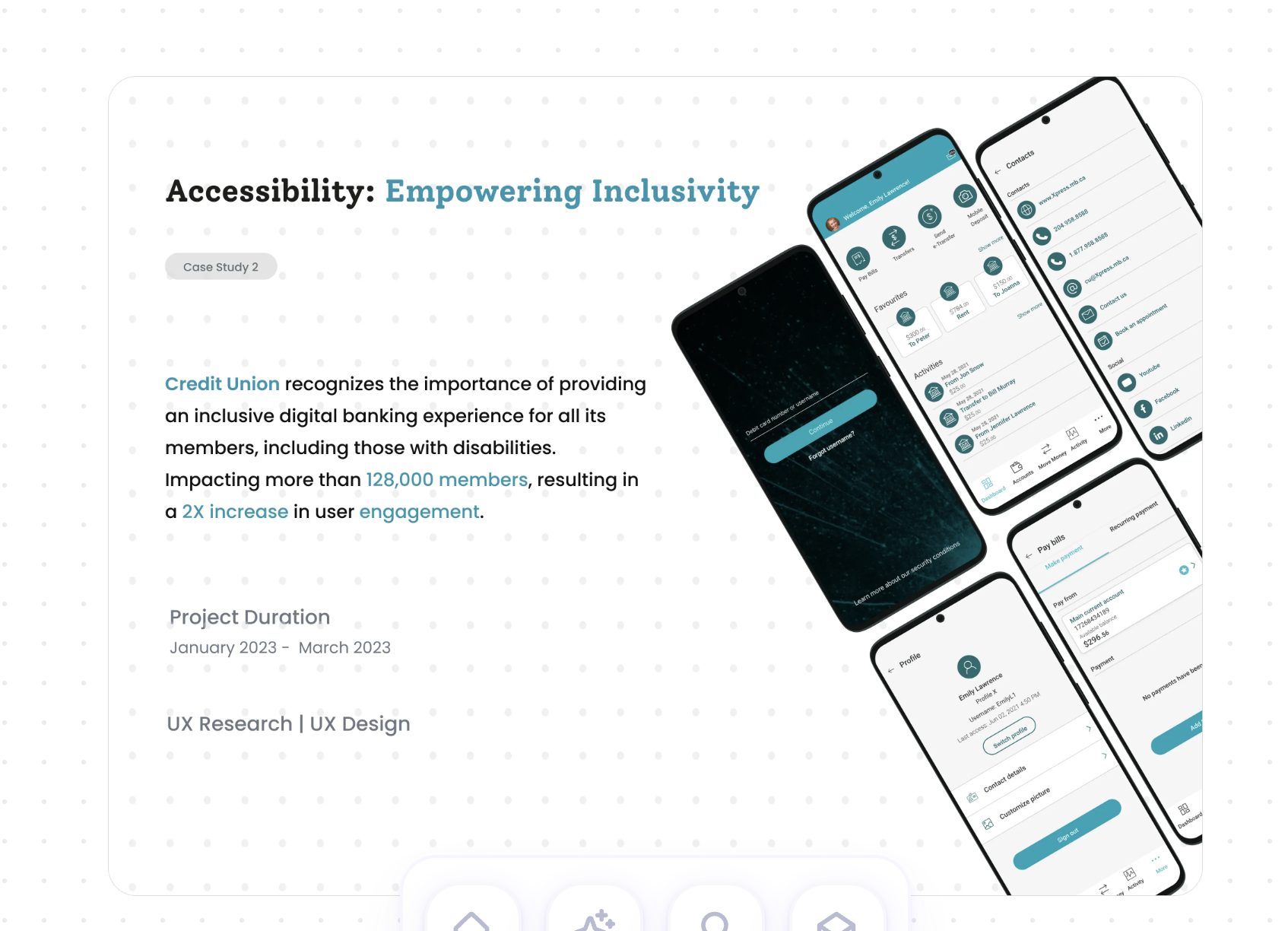
The largest credit union in Alberta.
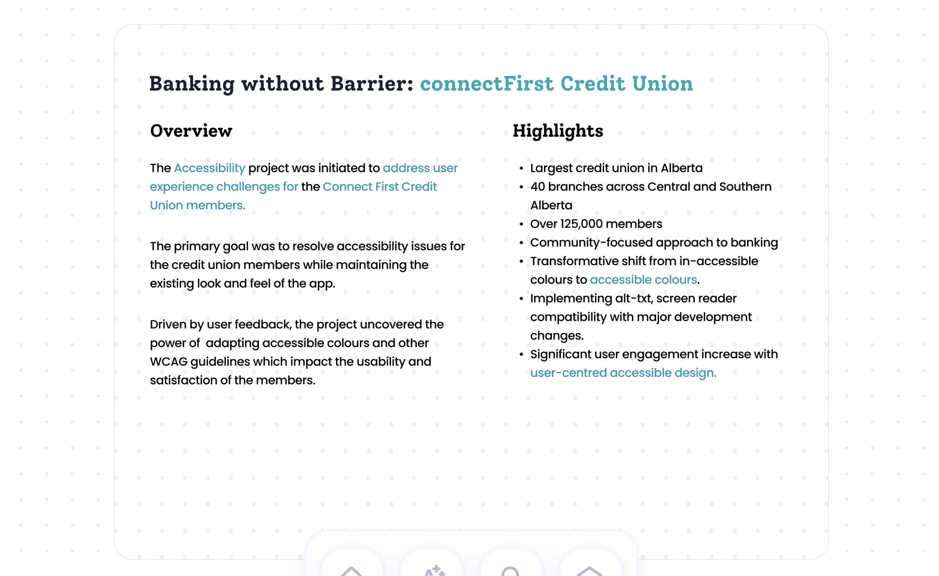
connectFirst Credit Union serves 125,000+ members across 40 branches in central and southern Alberta, with a community-focused approach to banking. They recognised the importance of an inclusive digital experience for all members — including those with disabilities.
The primary goal was to resolve accessibility issues for members while maintaining the existing look and feel of the app. Driven by user feedback, the project uncovered how powerfully accessible colour and other WCAG guidelines impact usability and satisfaction.
Every member, every time.
Accessibility was reframed as a user need, a business need, and a measurable impact — not a compliance checkbox.
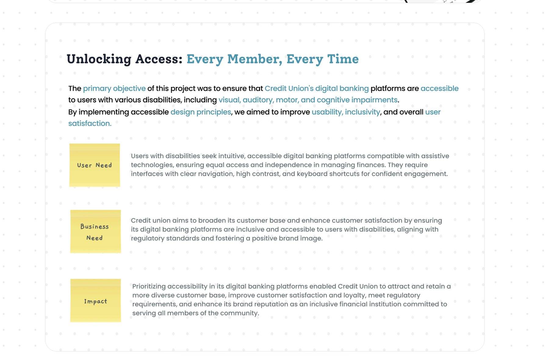
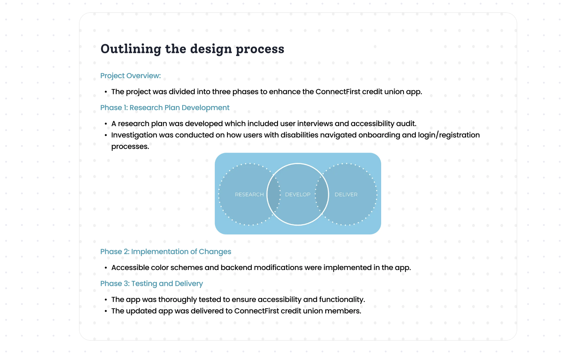
Research → Develop → Deliver.
The project ran in three phases: a research plan with user interviews and an accessibility audit, implementation of accessible colour and back-end changes, then thorough testing and delivery.
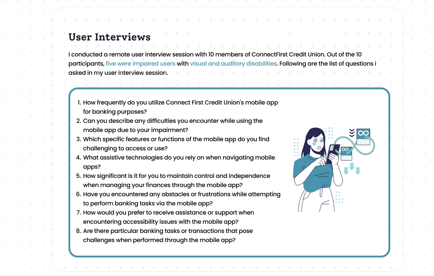
Interviewing members who are too often left out.
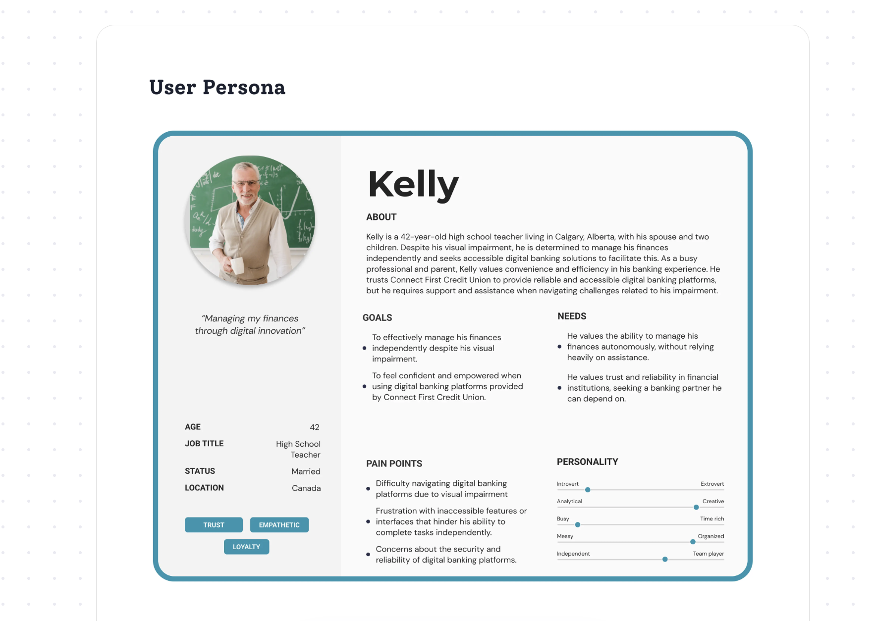
I ran remote interviews with 10 members — five of them with visual and auditory impairments — to understand how assistive technology met (and missed) their needs, then built a persona to keep the team grounded.
Colour was the silent barrier.
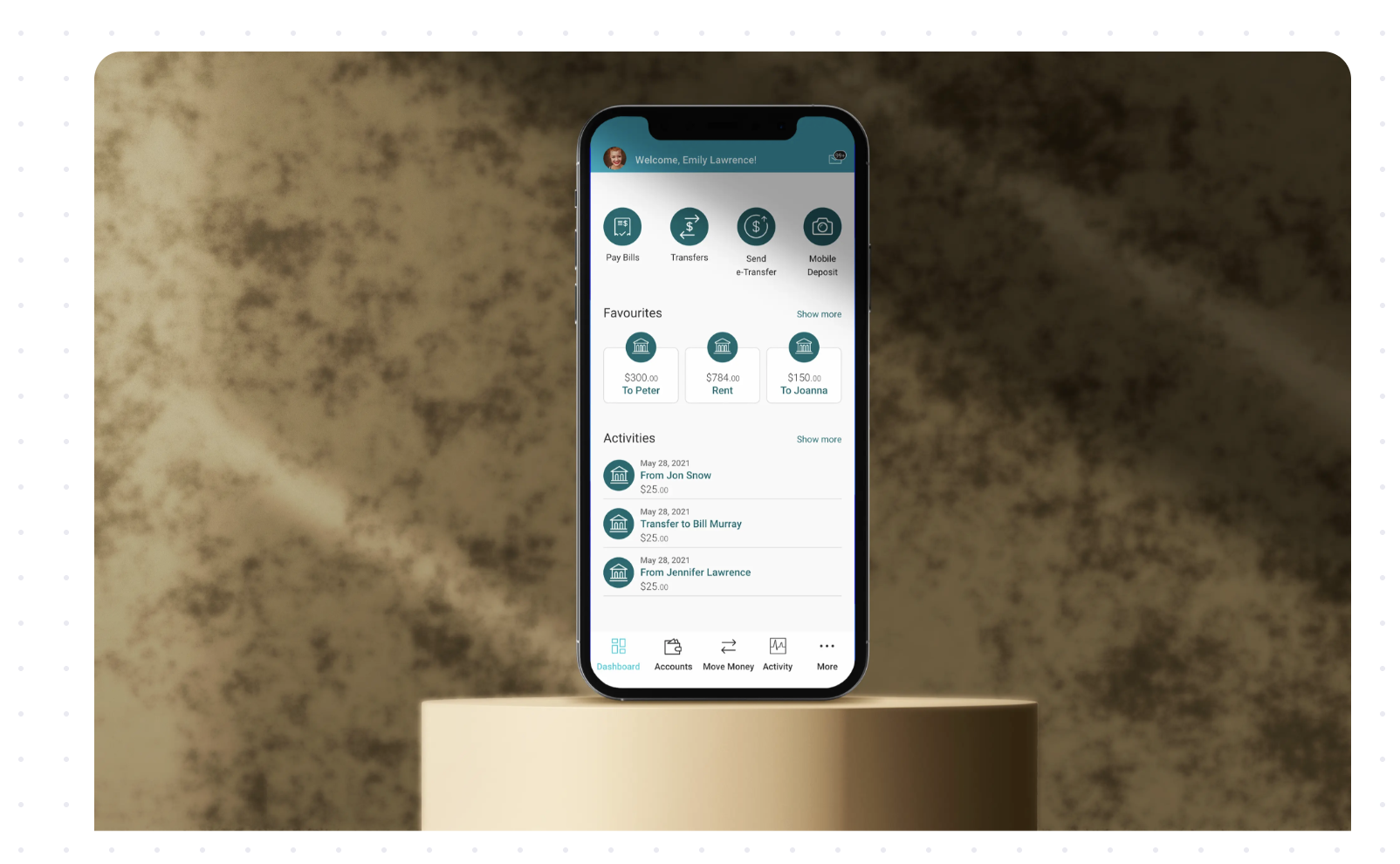
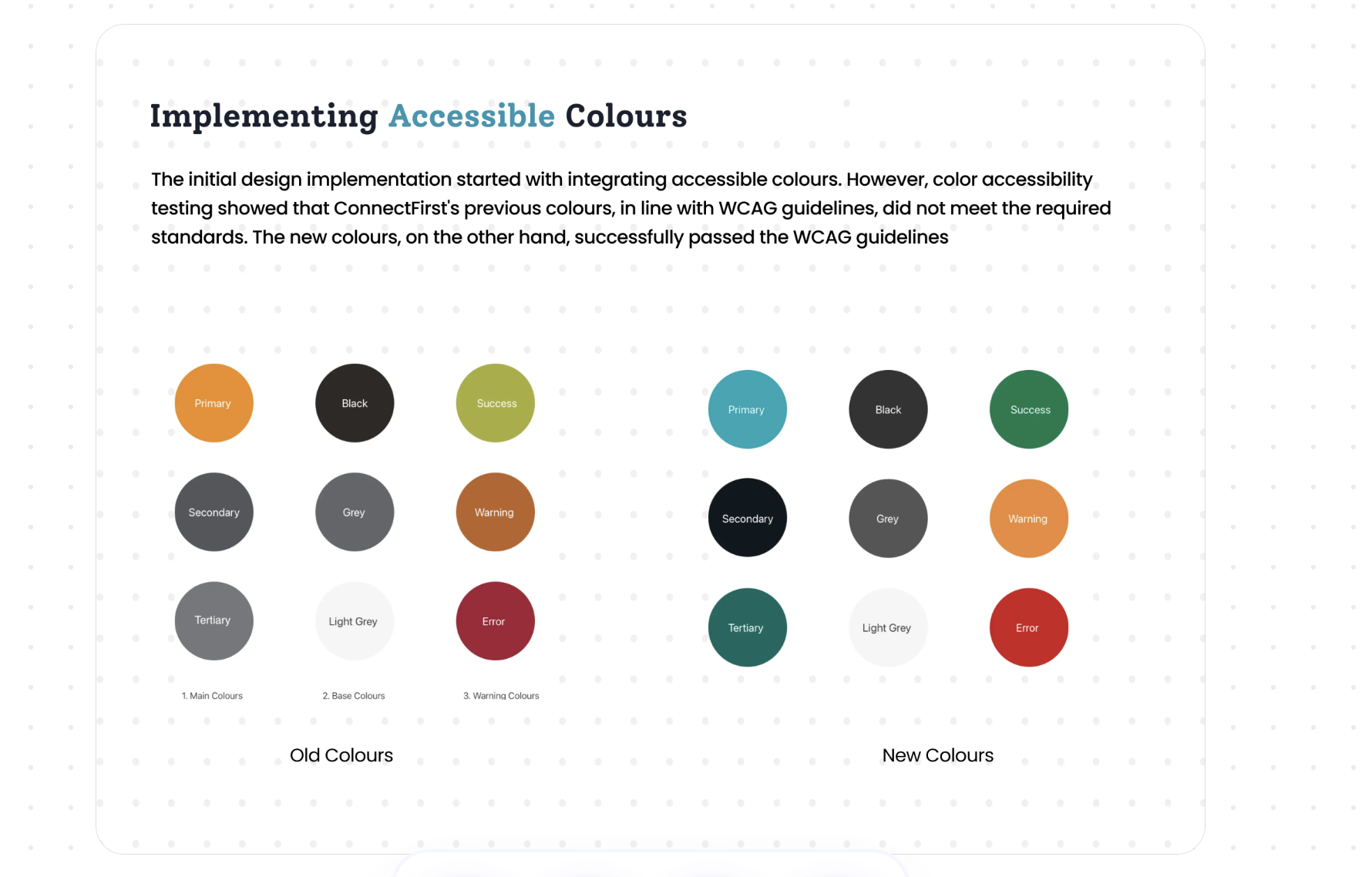
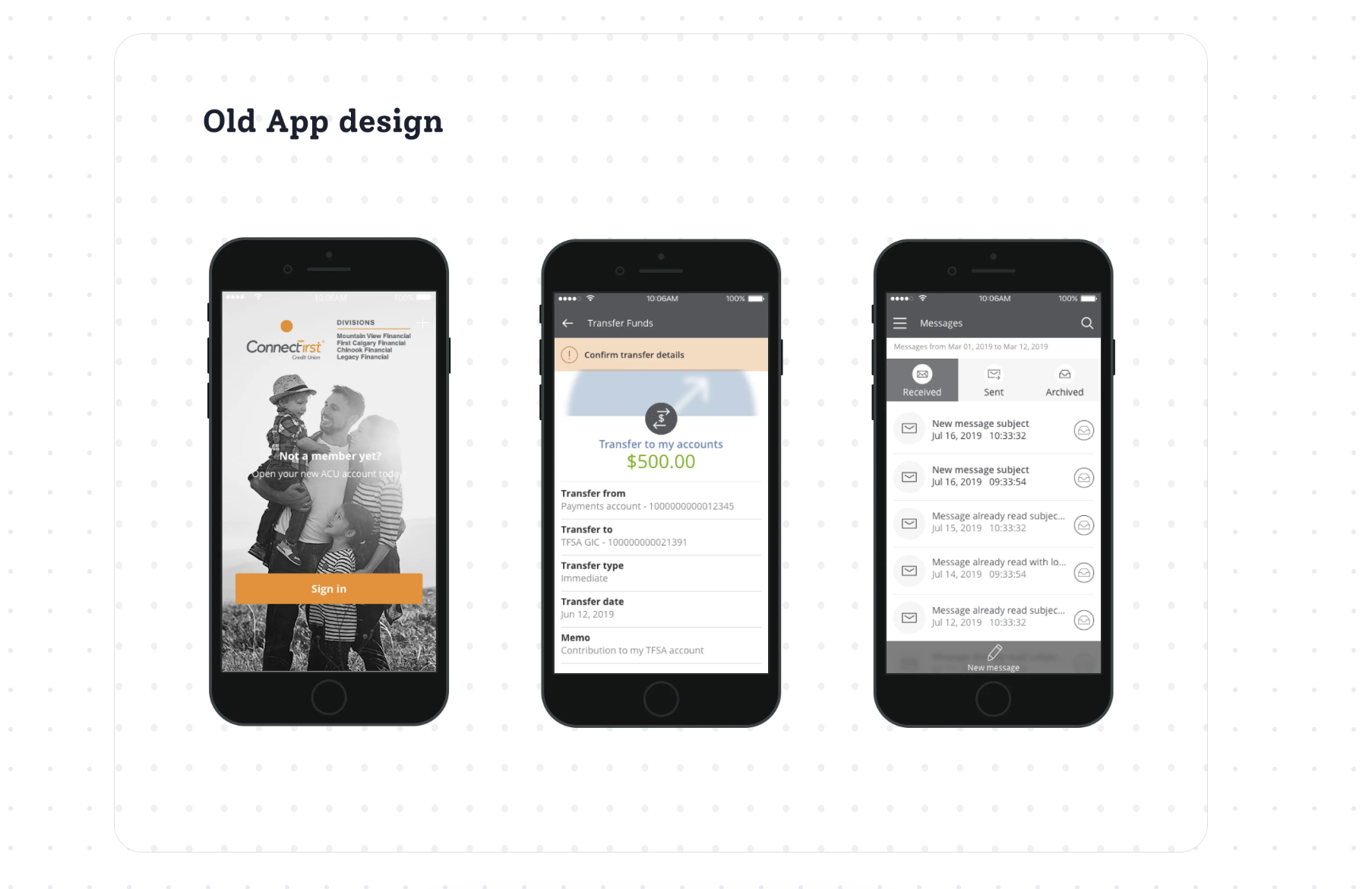
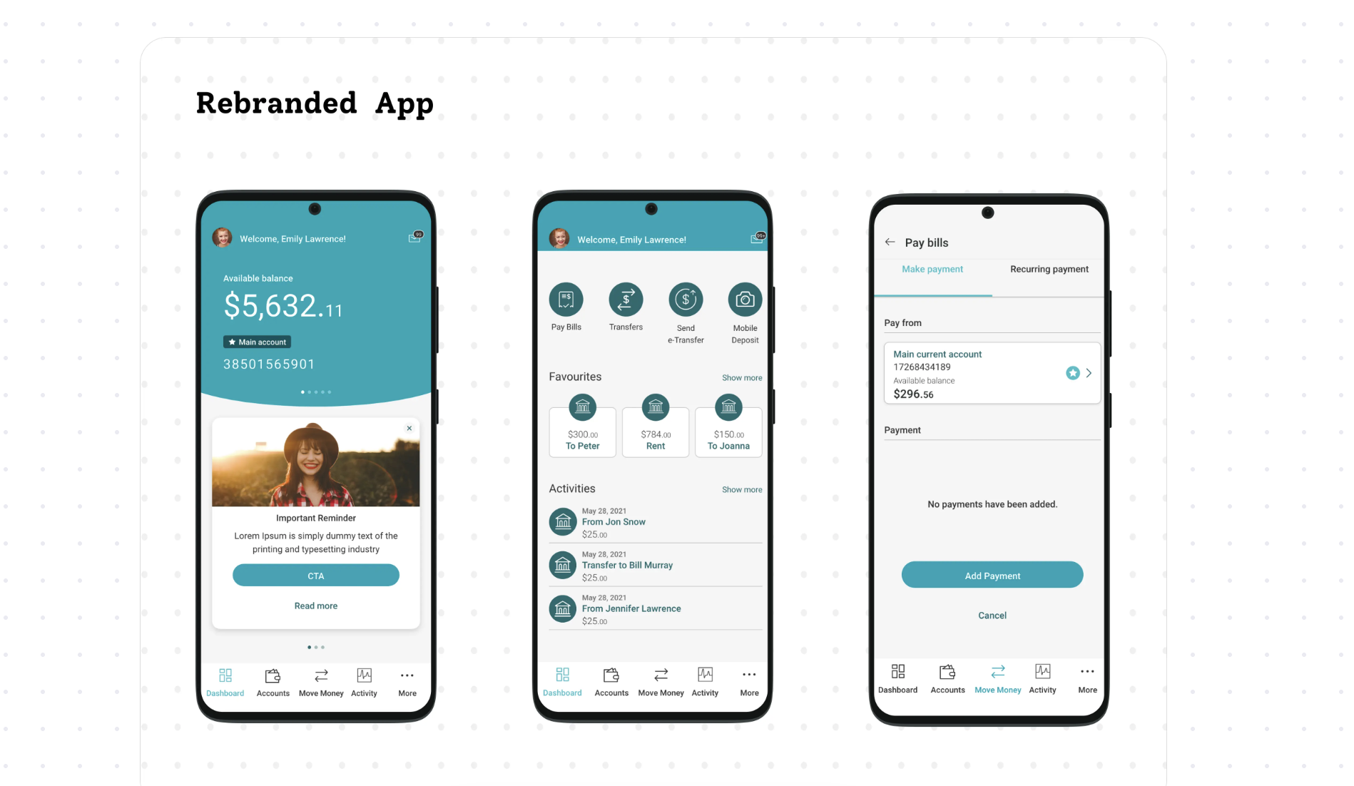
Accessibility testing showed connectFirst's existing palette didn't meet WCAG contrast requirements. A carefully retuned set of colours passed — without abandoning the brand. We could compare it directly against the old app.
Accessibility, written into development.
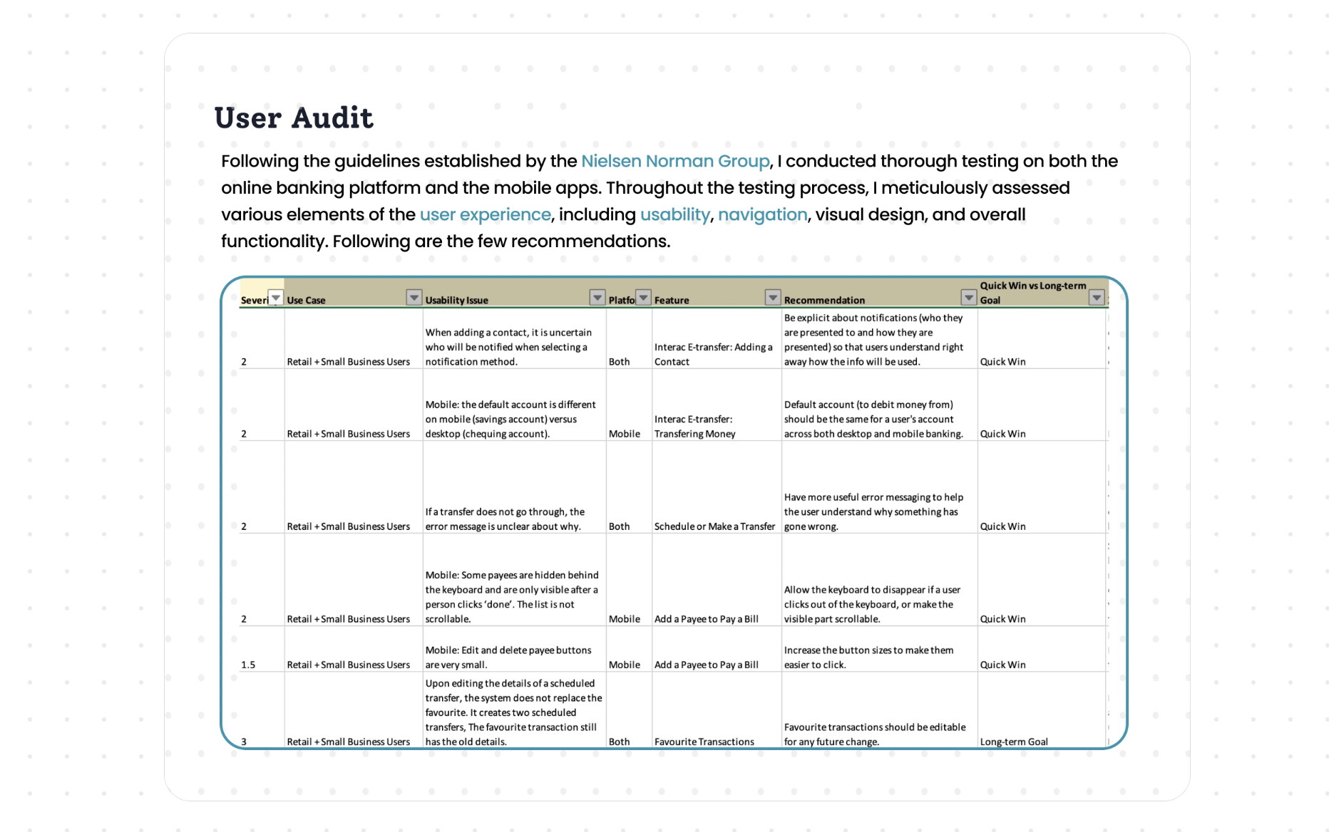
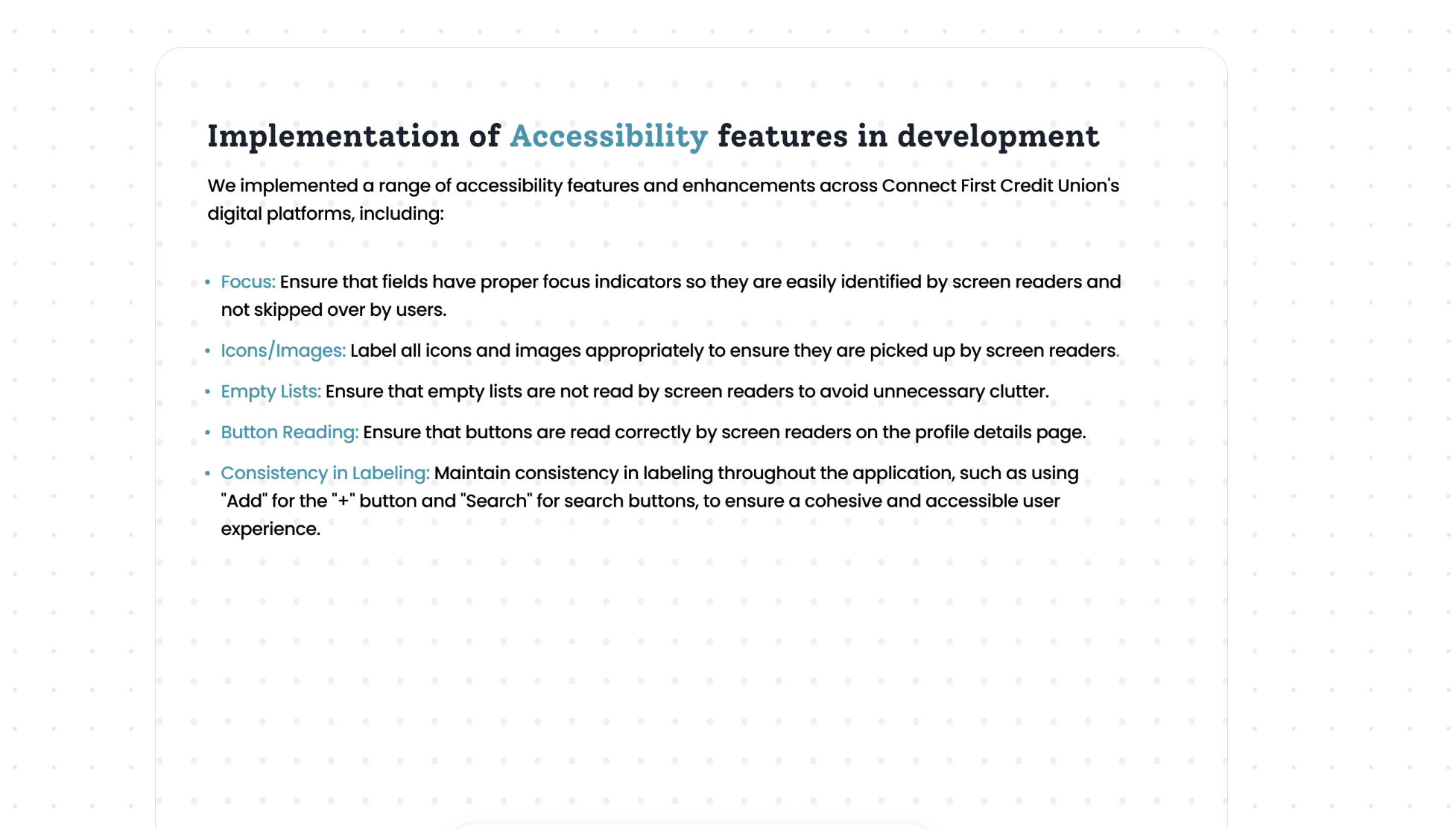
Beyond colour, I partnered with engineering on focus indicators, labelled icons and images, suppressed empty lists, correct button reading, and consistent labelling — then audited the whole experience against Nielsen Norman guidelines.
Inclusive design that paid off.
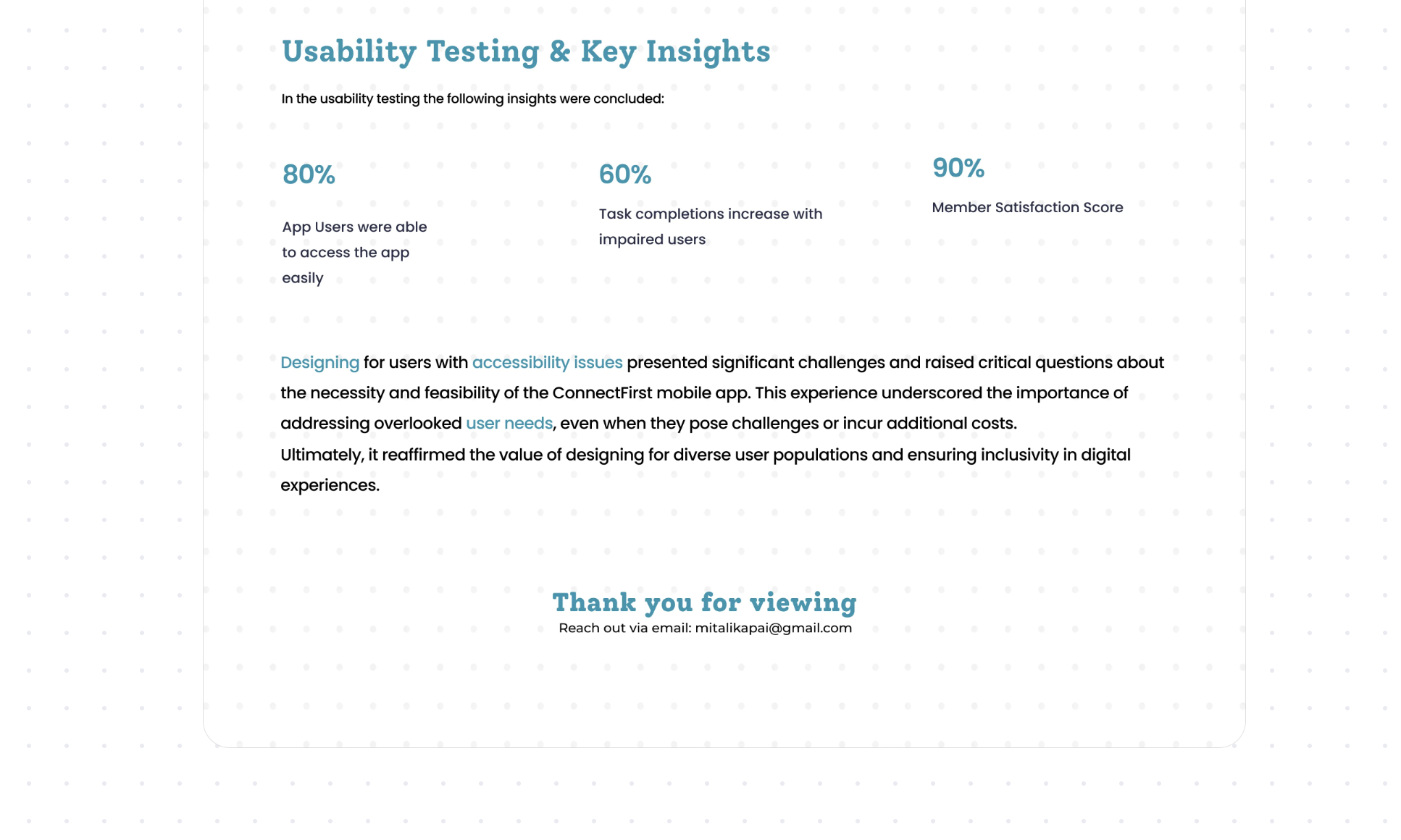
Designing for accessibility reaffirmed the value of addressing overlooked needs — and of designing for diverse populations, even when it's harder.— Reflection on the connectFirst accessibility project