Celero Xpress — digital banking, reinvented.
An omni-channel digital banking platform tailored to empower 30+ credit unions and touch the lives of 1.5 million members across Canada — rebuilt around speed, clarity and trust.
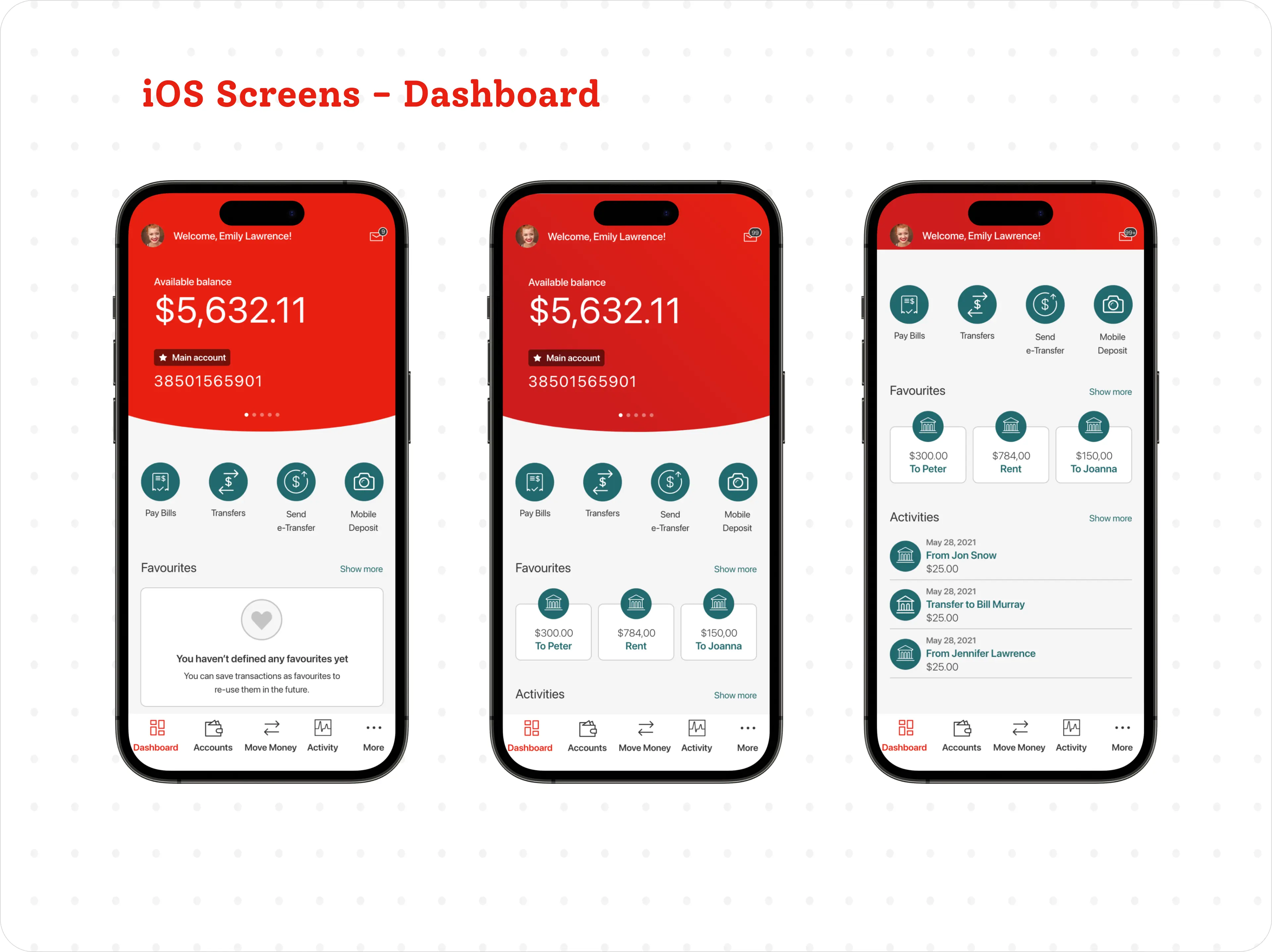
One platform. 30+ credit unions. 1.5M members.
The Credit Union System in Canada wanted a user-friendly digital banking platform to ensure seamless member experiences. The long-term goal: design web and mobile banking, propose new features, and create one omni-channel experience for the brand — spanning retail banking and small-business banking.
I led UX across responsive web, iOS and Android, building and maintaining Celero's centralized, white-labelled design system so every credit union shipped consistent, accessible experiences.
Outcome at a glance
- Xpress digital banking was implemented by 30+ credit unions across Canada.
- 1.5M+ members were exposed to the new design during usability testing and rollout.
- A 20% increase in digital adoption and a 15% lift in feature usage in pilot groups.
Problem, objective & outcome.
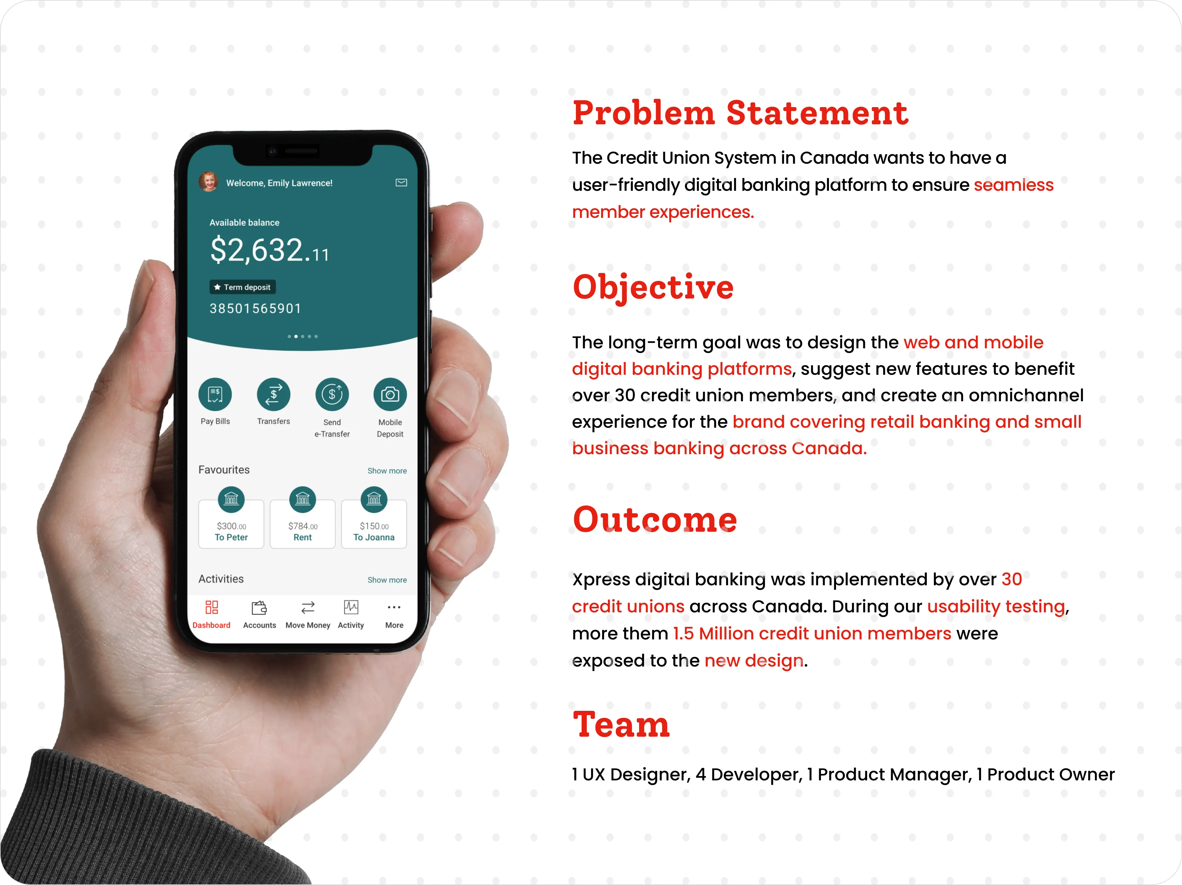
A systematic, user-centred path.
A clear five-stage process kept the work grounded in credit-union members throughout Canada — from research to a tested, shipped release.
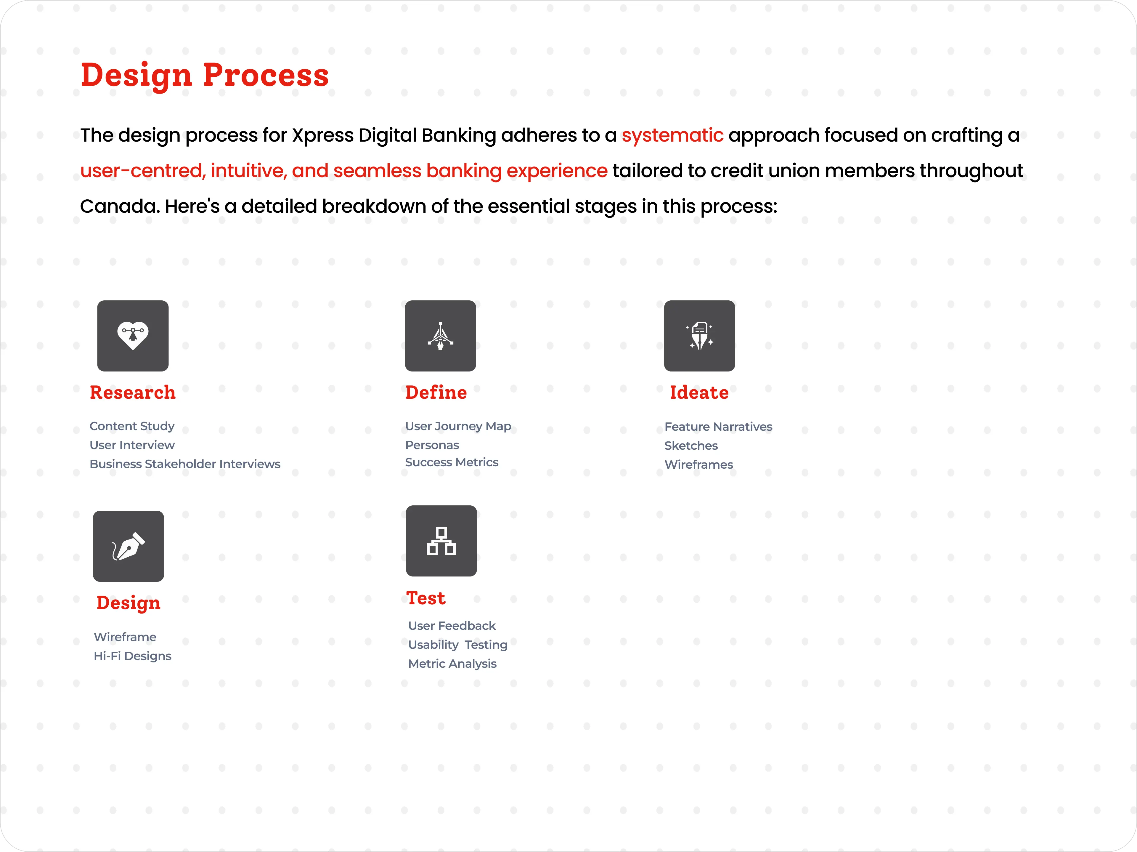
Listening to stakeholders & members.
I interviewed all stakeholders — credit-union business, tech and support staff — reviewed analytics, and held open discussions with frequent users, non-users and mobile app members.
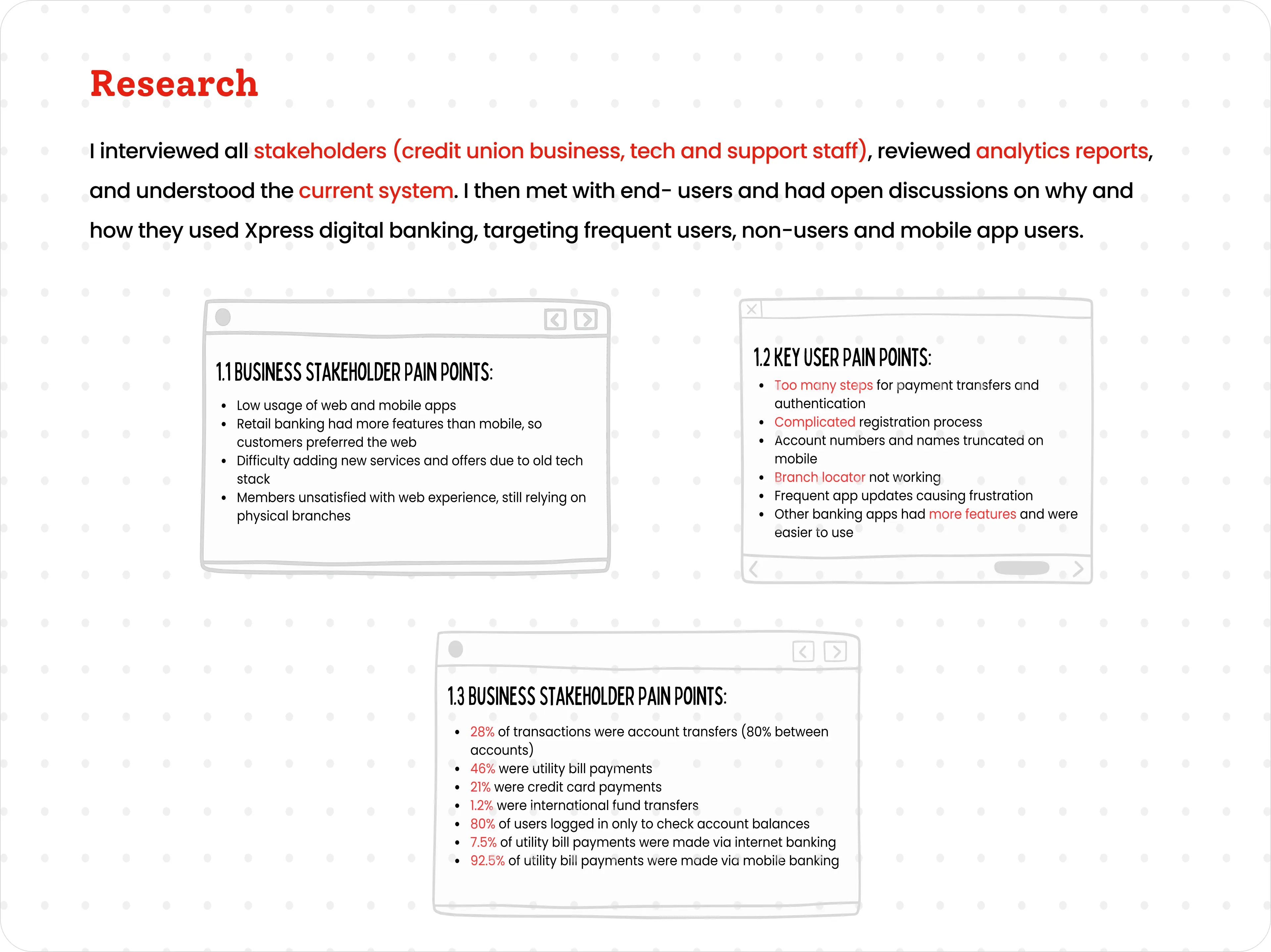
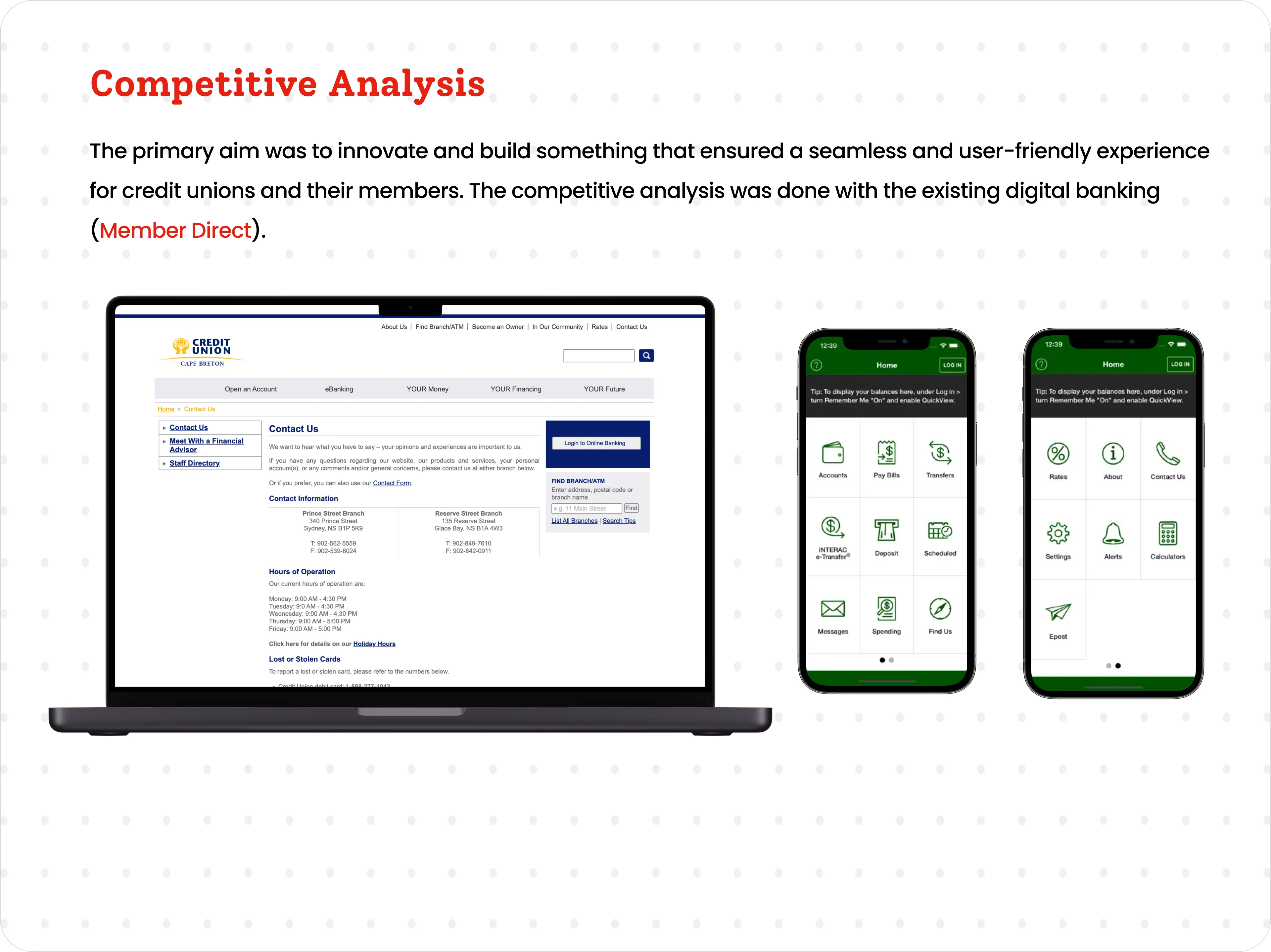
Competitive analysis
I benchmarked against the existing digital banking experience (Member Direct) to find where Xpress could leap ahead.
Turning findings into people & journeys.
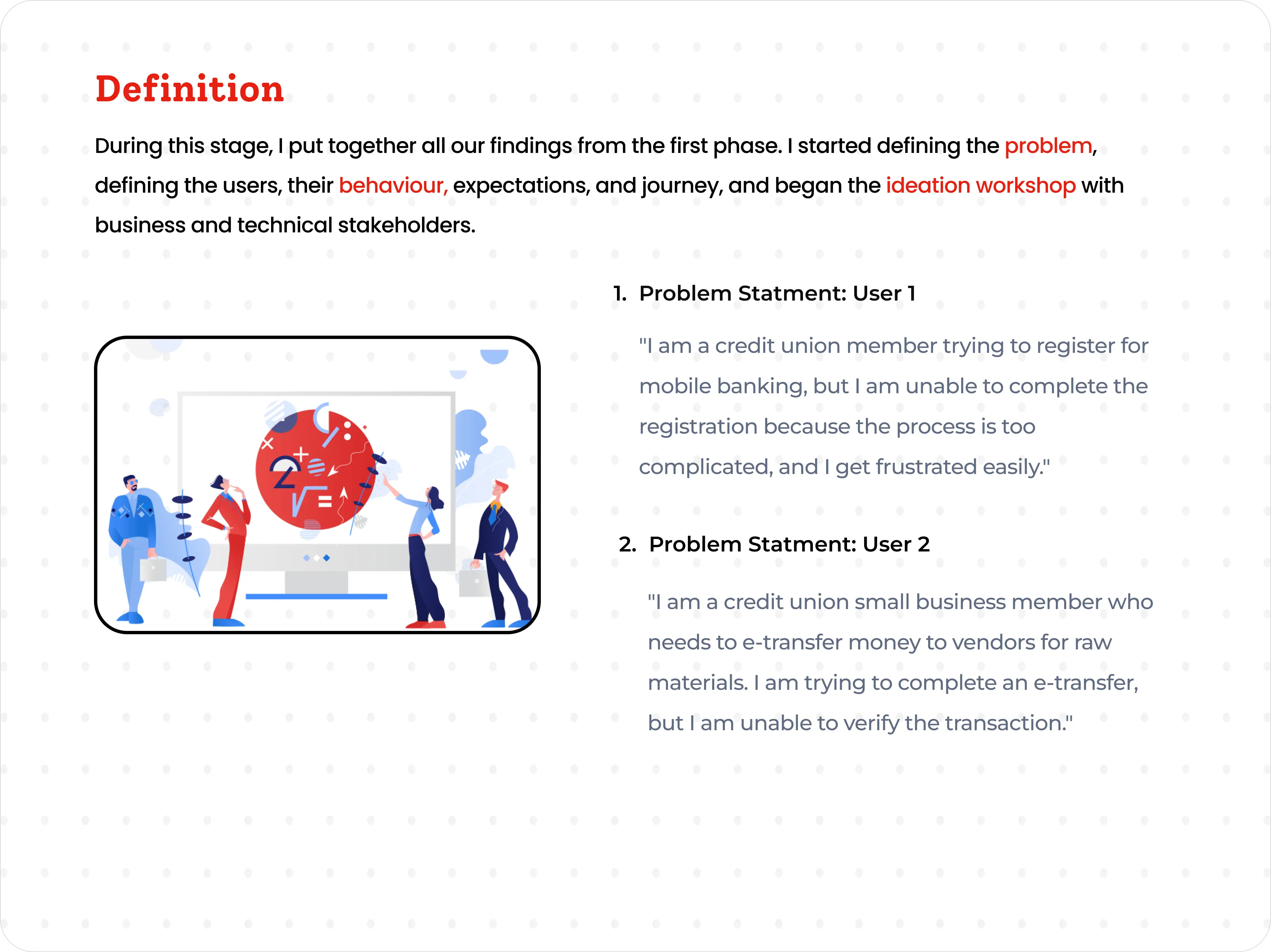
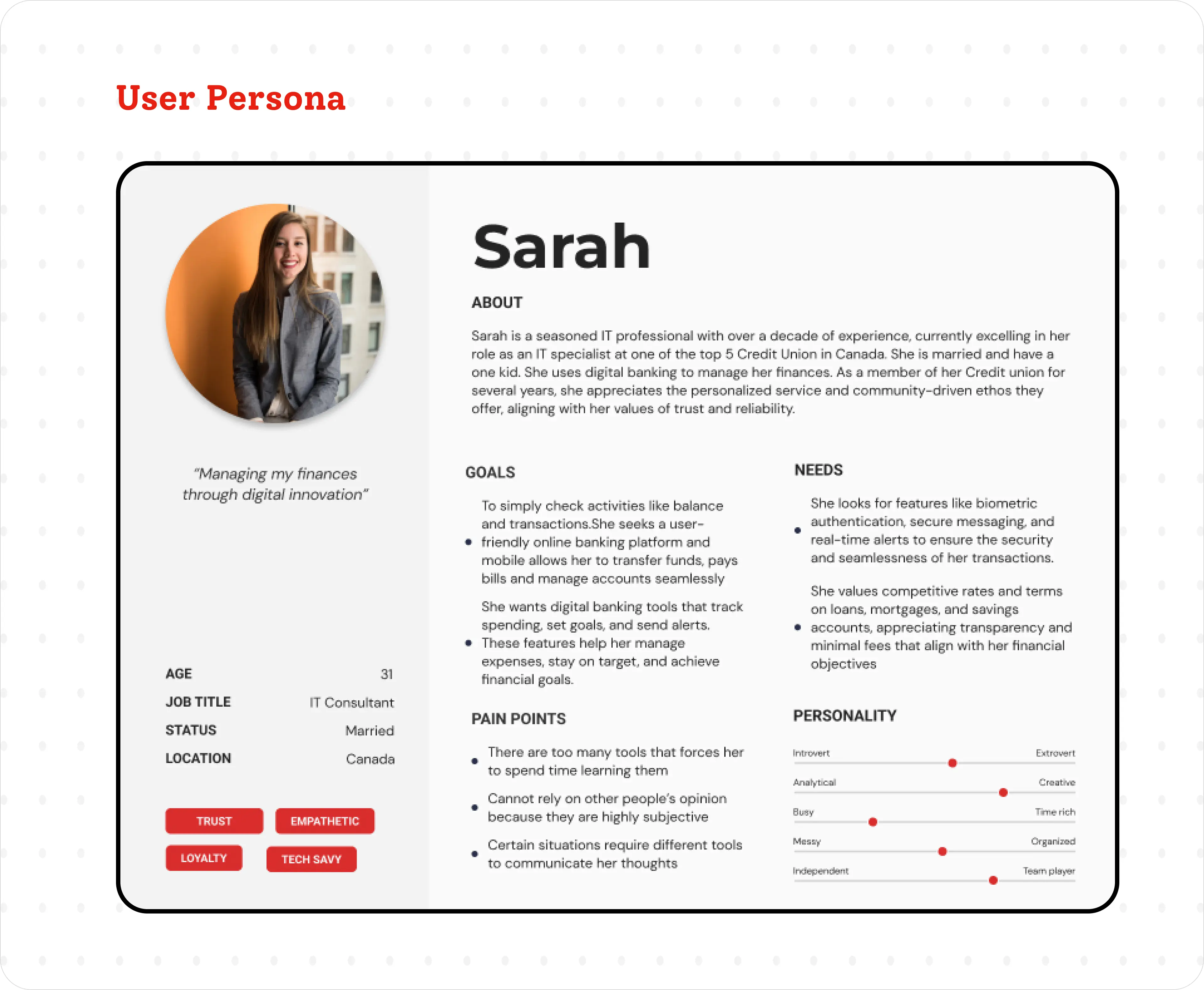
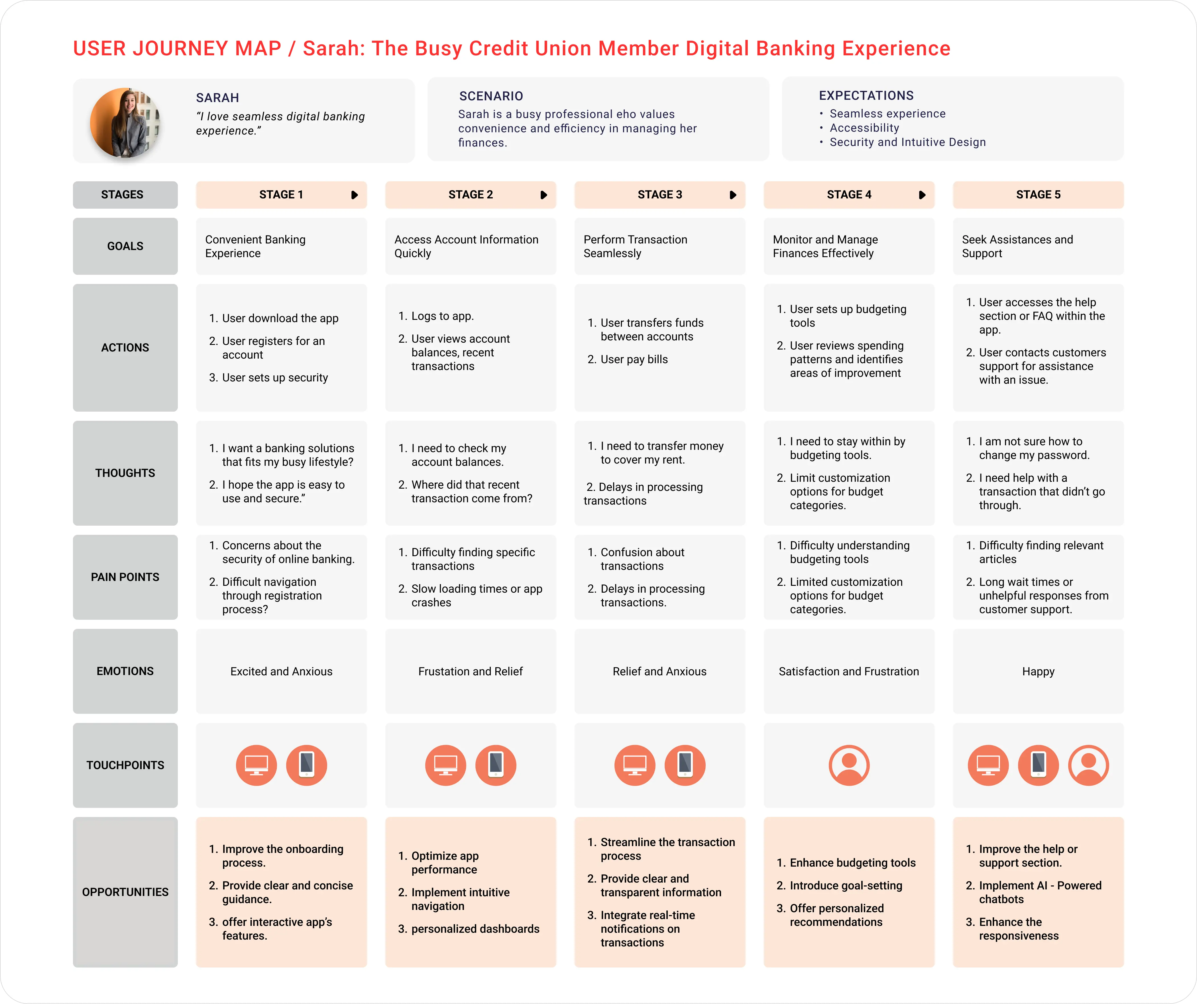
I synthesized the research into problem statements, a primary persona, and an end-to-end journey map — defining who we served, how they behaved, and where the friction lived.
Prioritising what matters.
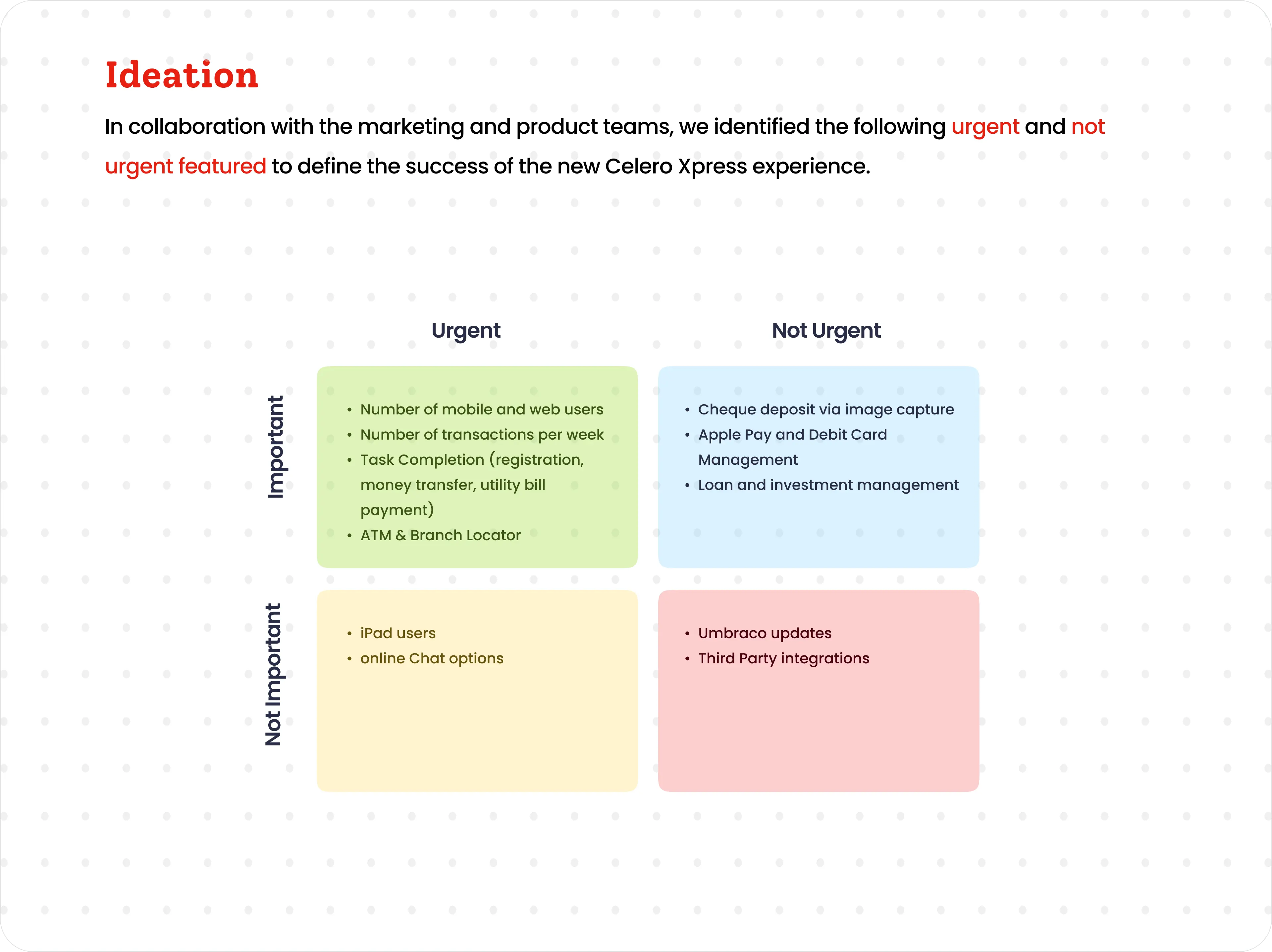
With marketing and product, I mapped urgent vs. not-urgent, important vs. not-important features to define what success looked like for the new Celero Xpress experience.
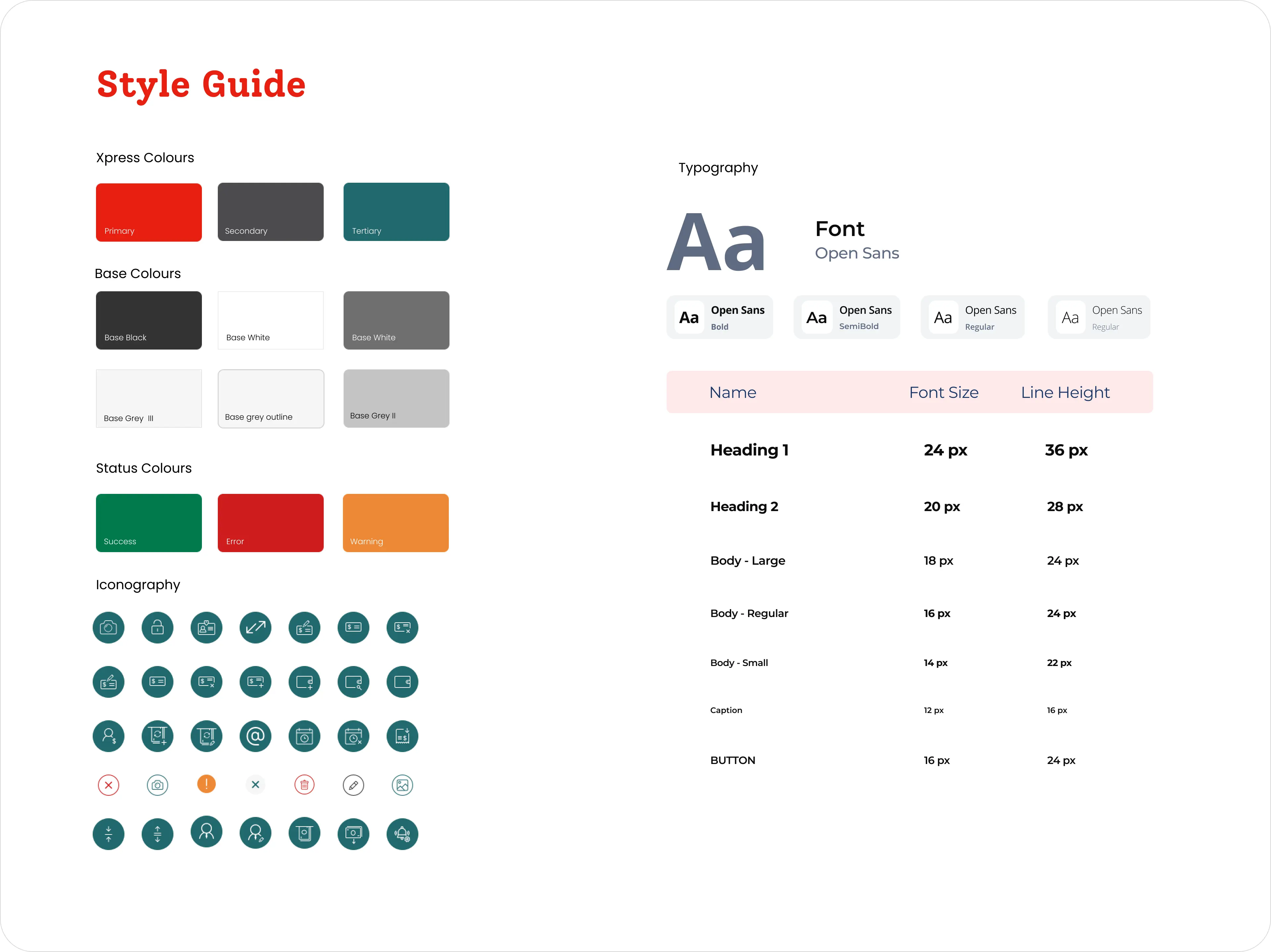
The Xpress style guide.
The centralized, white-labelled system — colour, typography and iconography — kept 30+ credit unions consistent and WCAG-compliant.
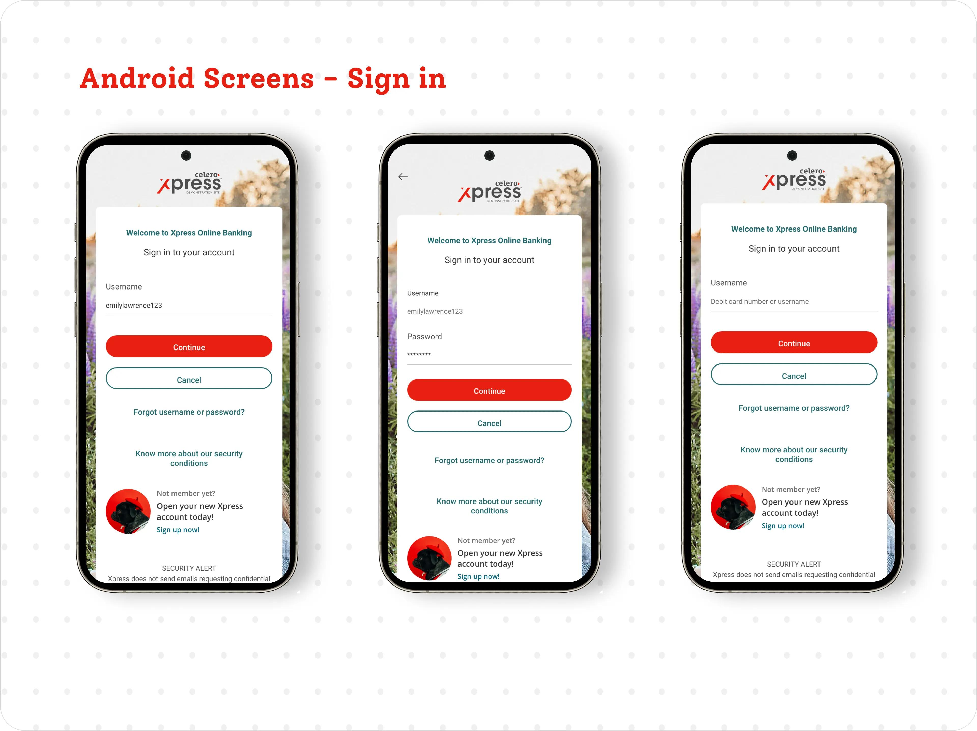
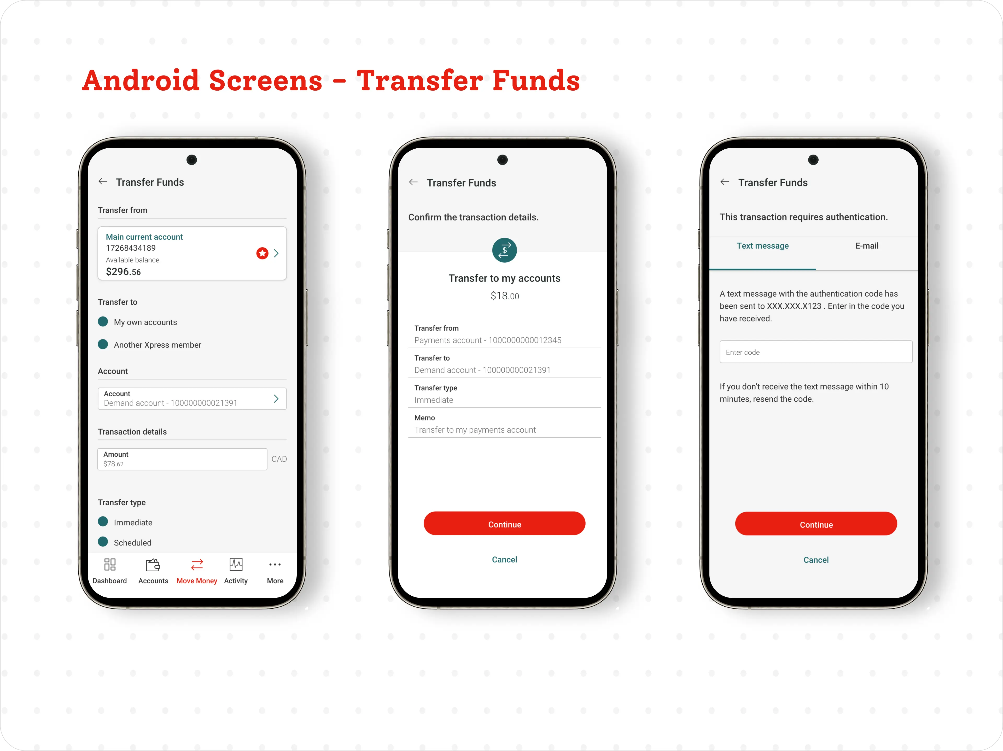
Shipped across every platform.
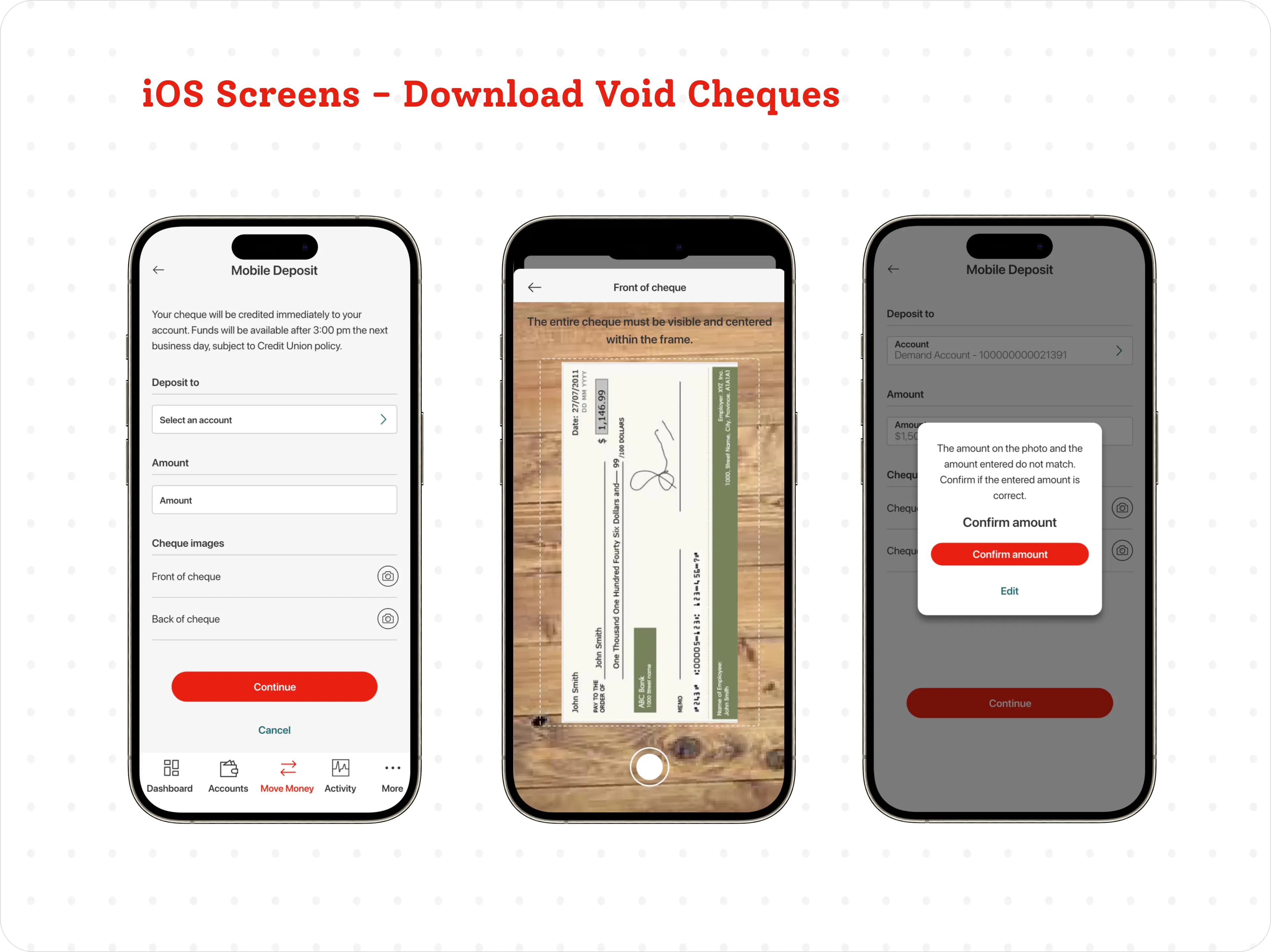
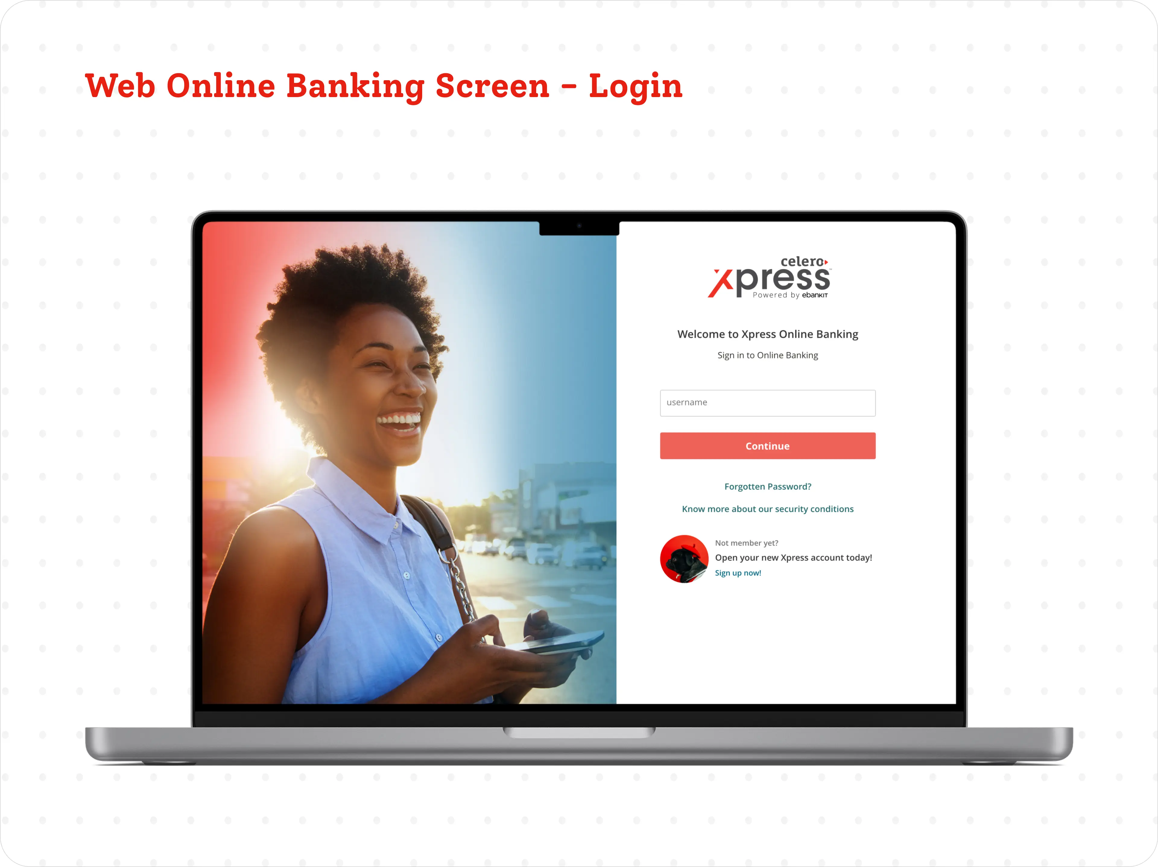
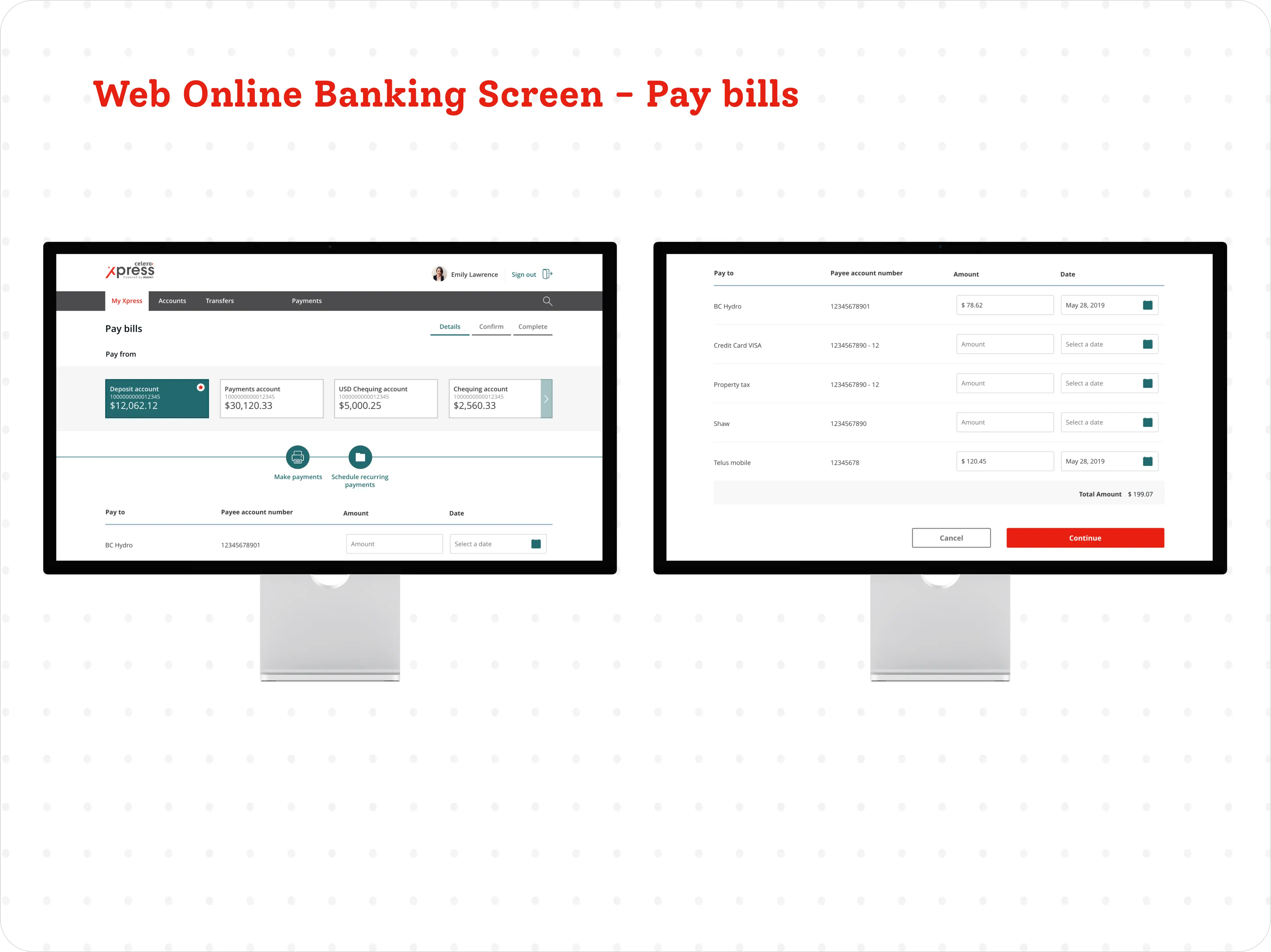
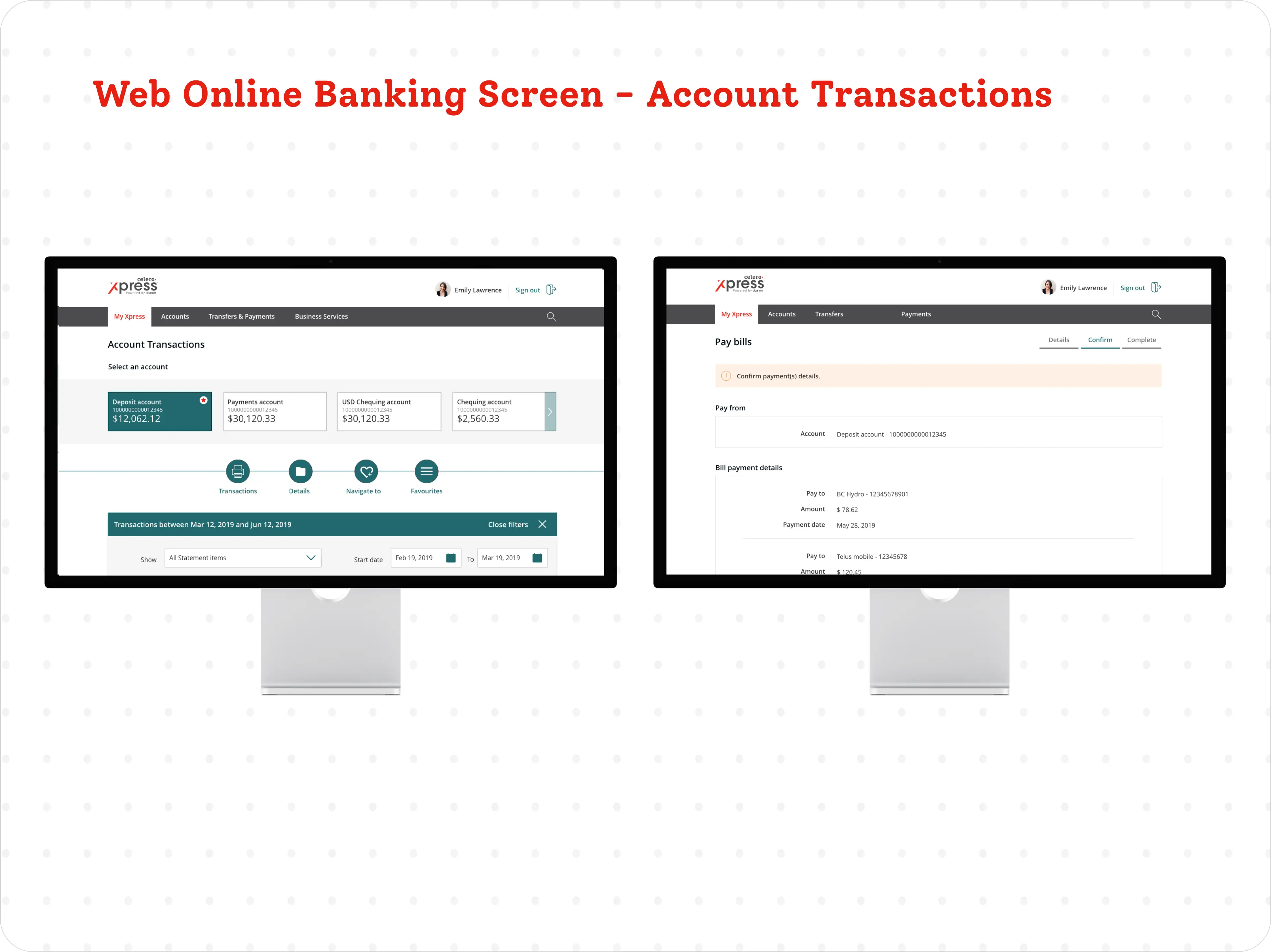
From sign-in to transfers, deposits and bill payments — designed and tested for iOS, Android and responsive web.
The numbers moved.
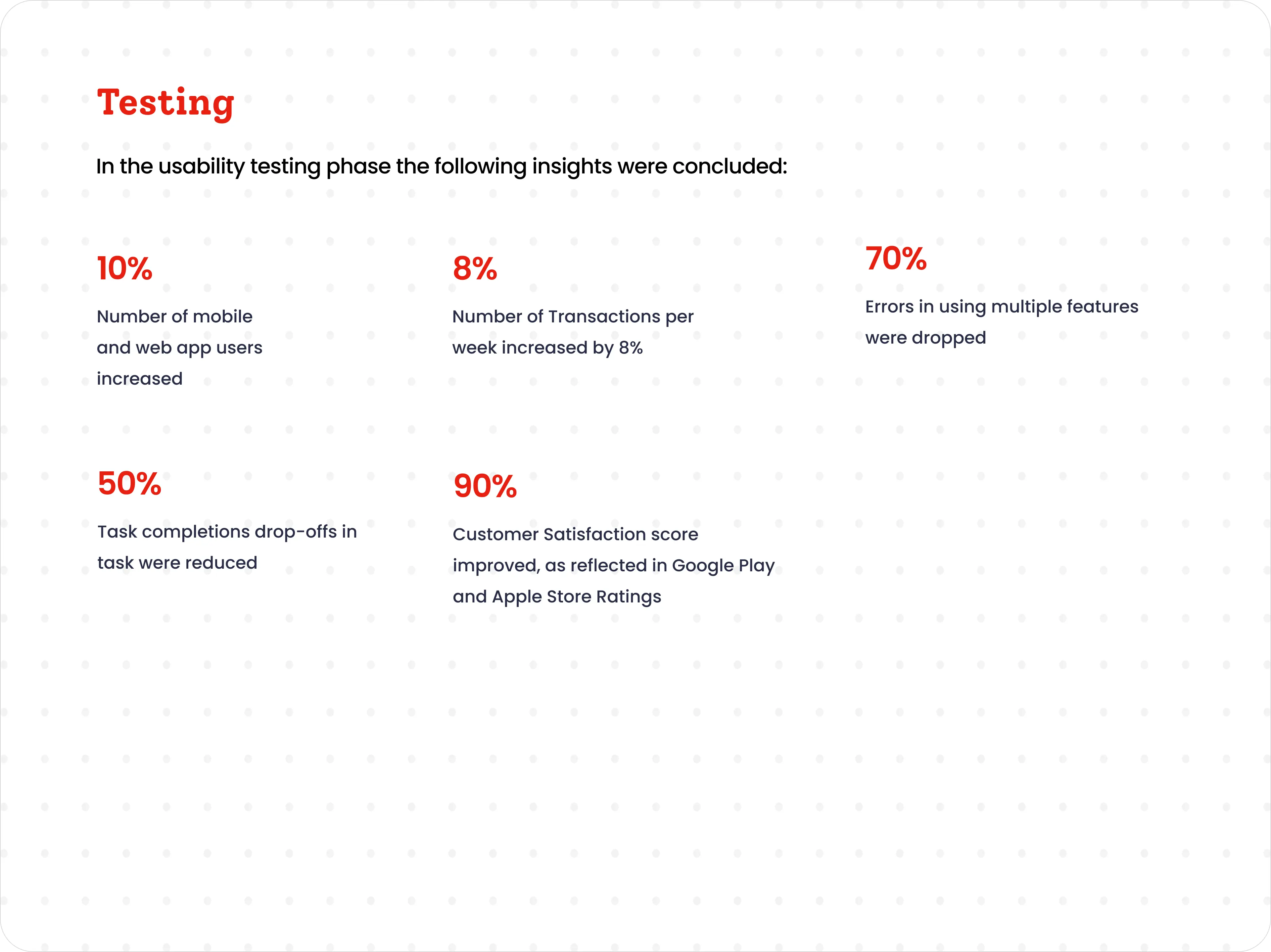
Usability testing across the pilot groups confirmed the redesign delivered on speed, clarity and adoption.
Real members, real reactions.
Functionality at the forefront and no longer hidden. Love the new look and feel — so much more intuitive.— App-store reviews from Xpress members