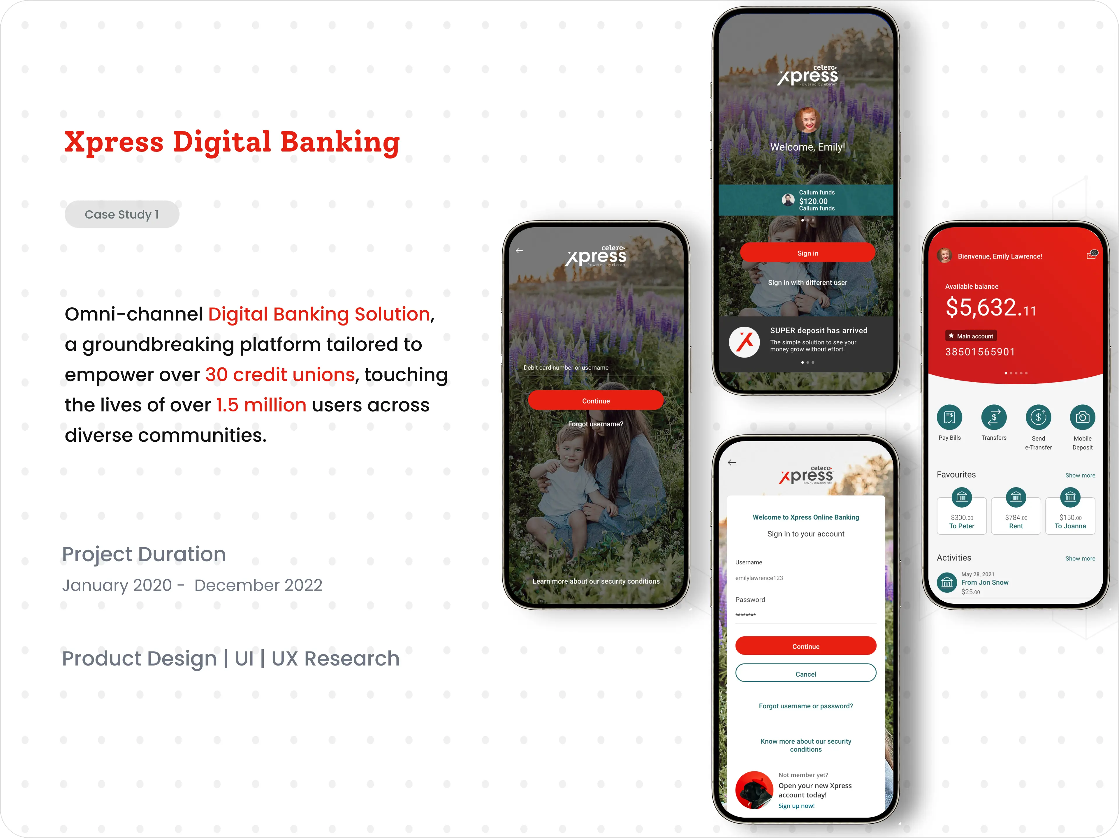
A digital banking platform used by 30+ credit unions and 1.5 million members across Canada. I led the design across web, iOS and Android, and rebuilt it around three things members kept asking for: speed, clarity and trust.

Overview
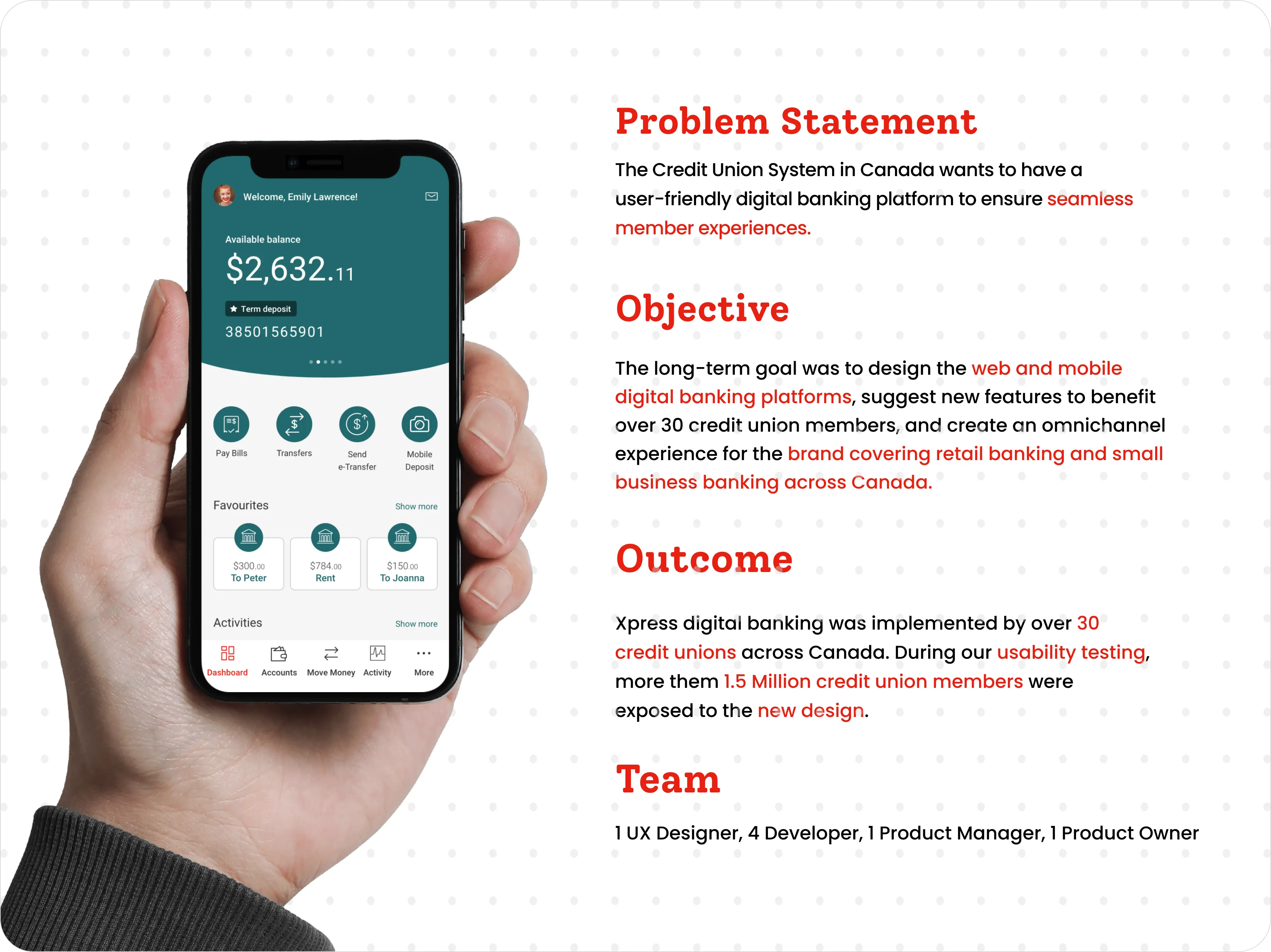
Canada's credit union system wanted one digital banking experience that members would actually enjoy using. The long-term plan was to design web and mobile banking, suggest new features, and bring everything together into one experience for the brand, covering both personal and small-business banking.
I led UX across responsive web, iOS and Android. I also built and looked after Celero's shared, white-labelled design system, so every credit union could ship something consistent and accessible under its own brand.
Why this mattered
Most members were checking balances and moving money on their phones, but the existing online banking was built for a desktop screen and a different decade. Simple tasks took too many taps, useful features were buried in menus, and members kept calling their credit union for help with things the app should have made obvious.
For the credit unions, that wasn't just a design problem. Every confused member meant a support call, and every member who gave up on the app was a little more likely to move to a big bank with a slicker one. Xpress needed to feel modern and trustworthy, and still work for 30+ credit unions, each with its own brand and members.
The challenges
Every credit union wanted its own colours and logo. The design had to look right for all of them without turning into 30 apps to maintain.
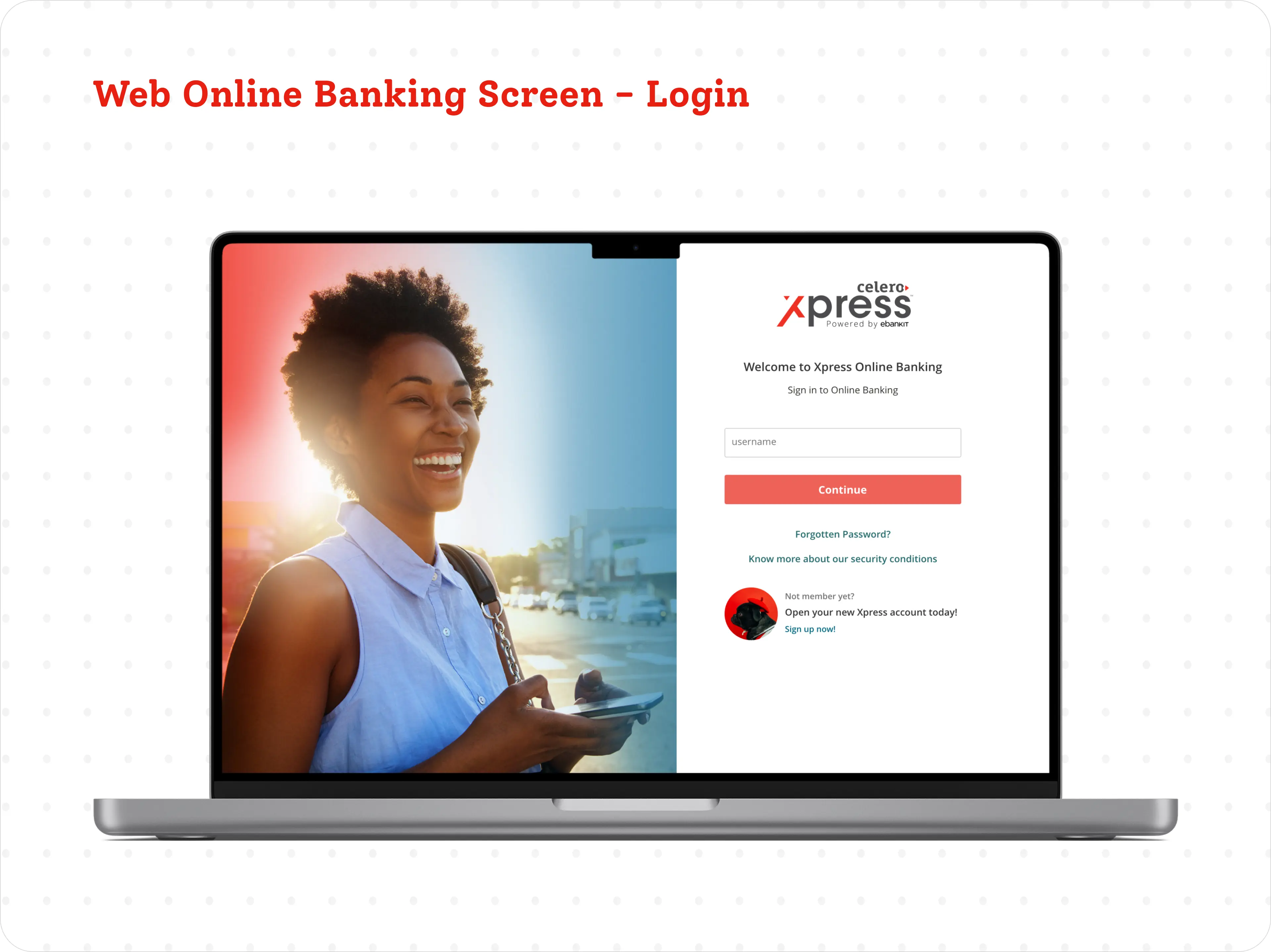
Members wanted to get in fast. Security needed one-time codes and extra checks. Both had to feel reasonable, not like hurdles.
Web, iOS and Android each have their own habits. Members switch between them, so it had to feel familiar everywhere.
Students to retirees, daily users to people who log in twice a year. Clear had to mean clear for all of them.
A confusing transfer or a rejected cheque photo costs people real money and stress. Mistakes needed to be rare and easy to recover from.
Every brand colour combination still had to meet WCAG, so the system had to stop credit unions from accidentally breaking contrast.
The brief

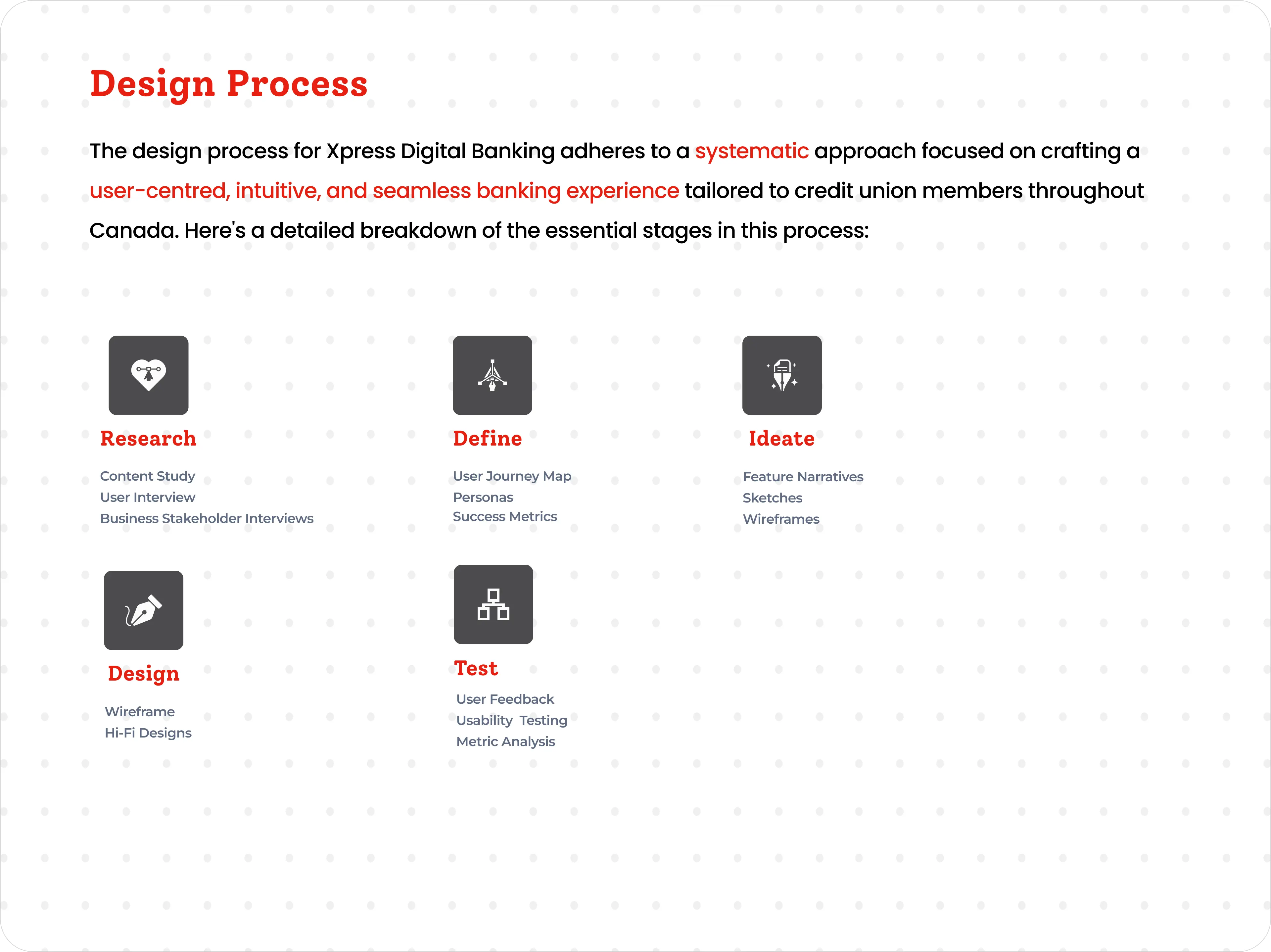
Design process
Five stages kept the work grounded in what credit union members across Canada actually needed, from the first interviews to a tested, shipped release.

01 · Research
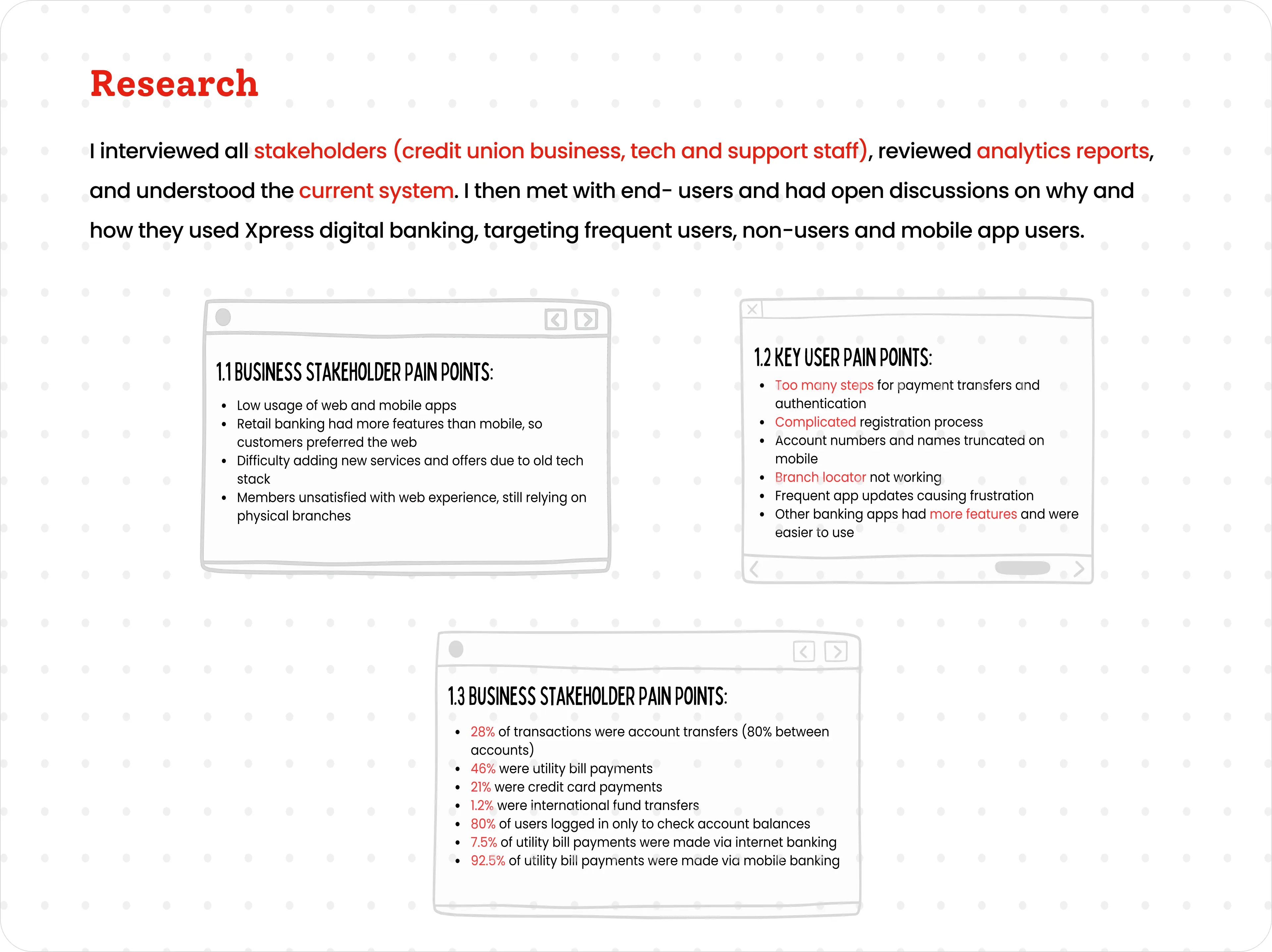
I interviewed people across the credit unions, from business and tech to the support staff who hear member complaints first. I went through the analytics and had open conversations with frequent users, non-users and mobile app members.

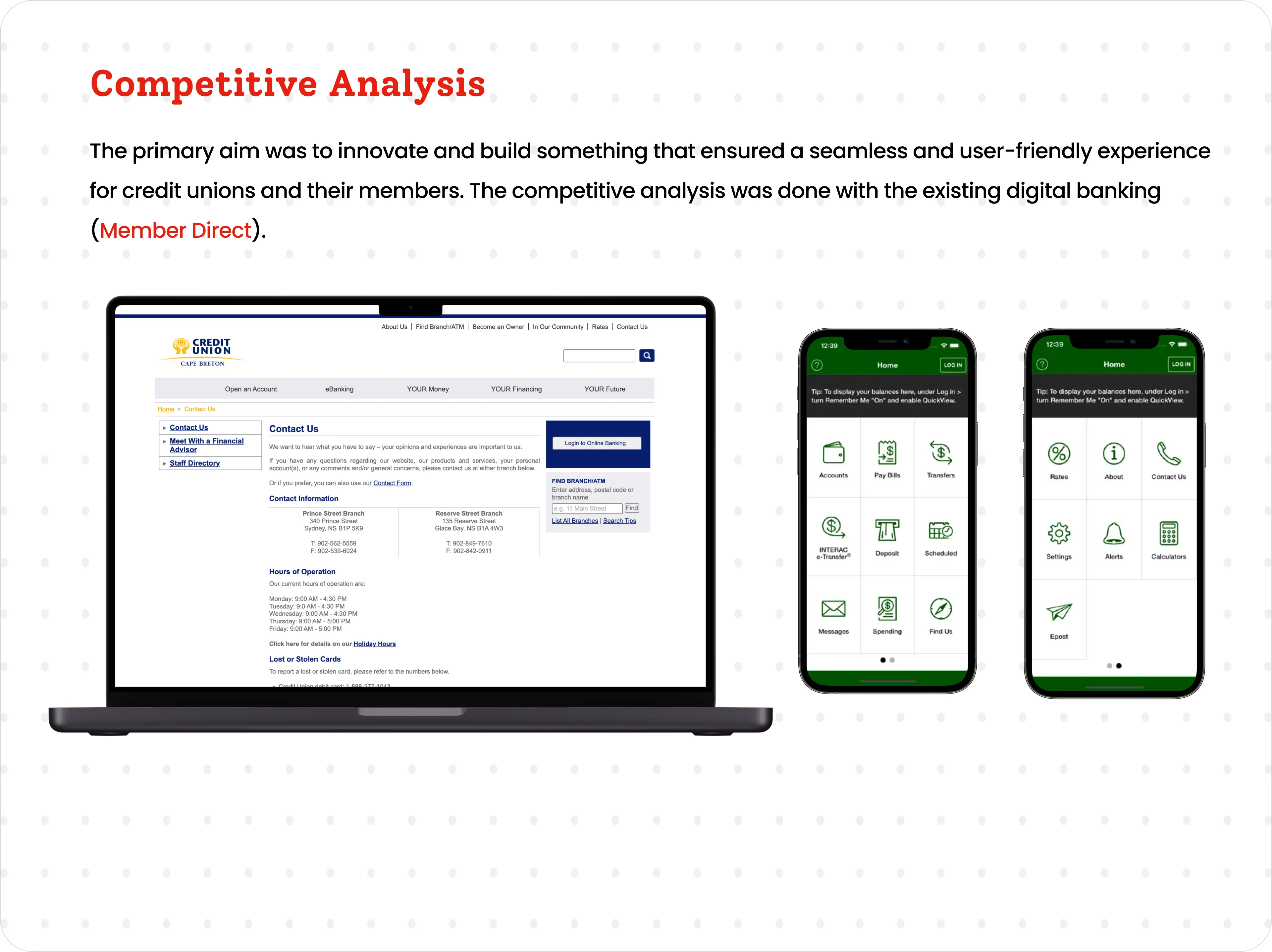
I compared Xpress with the existing online banking experience, Member Direct, to see where we could make the biggest jump.

02 · Define
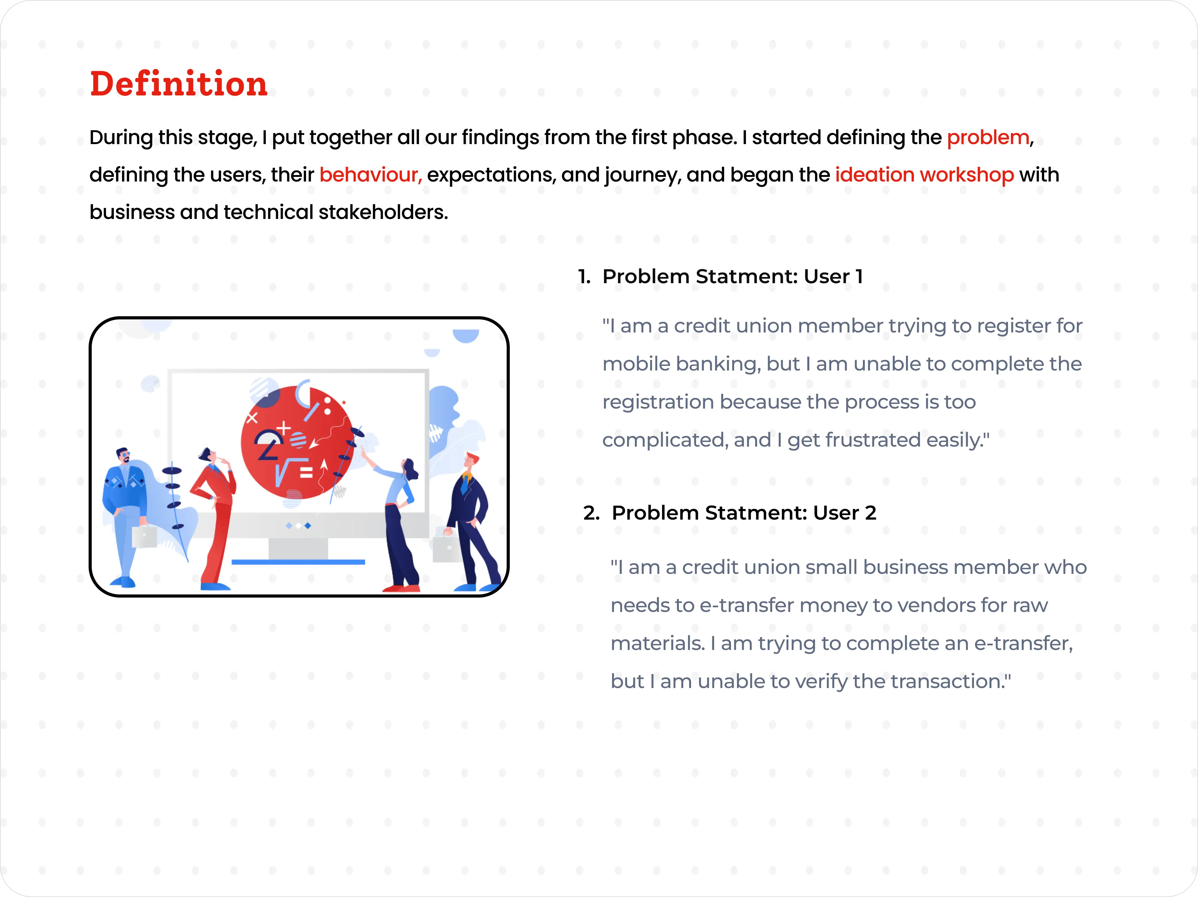
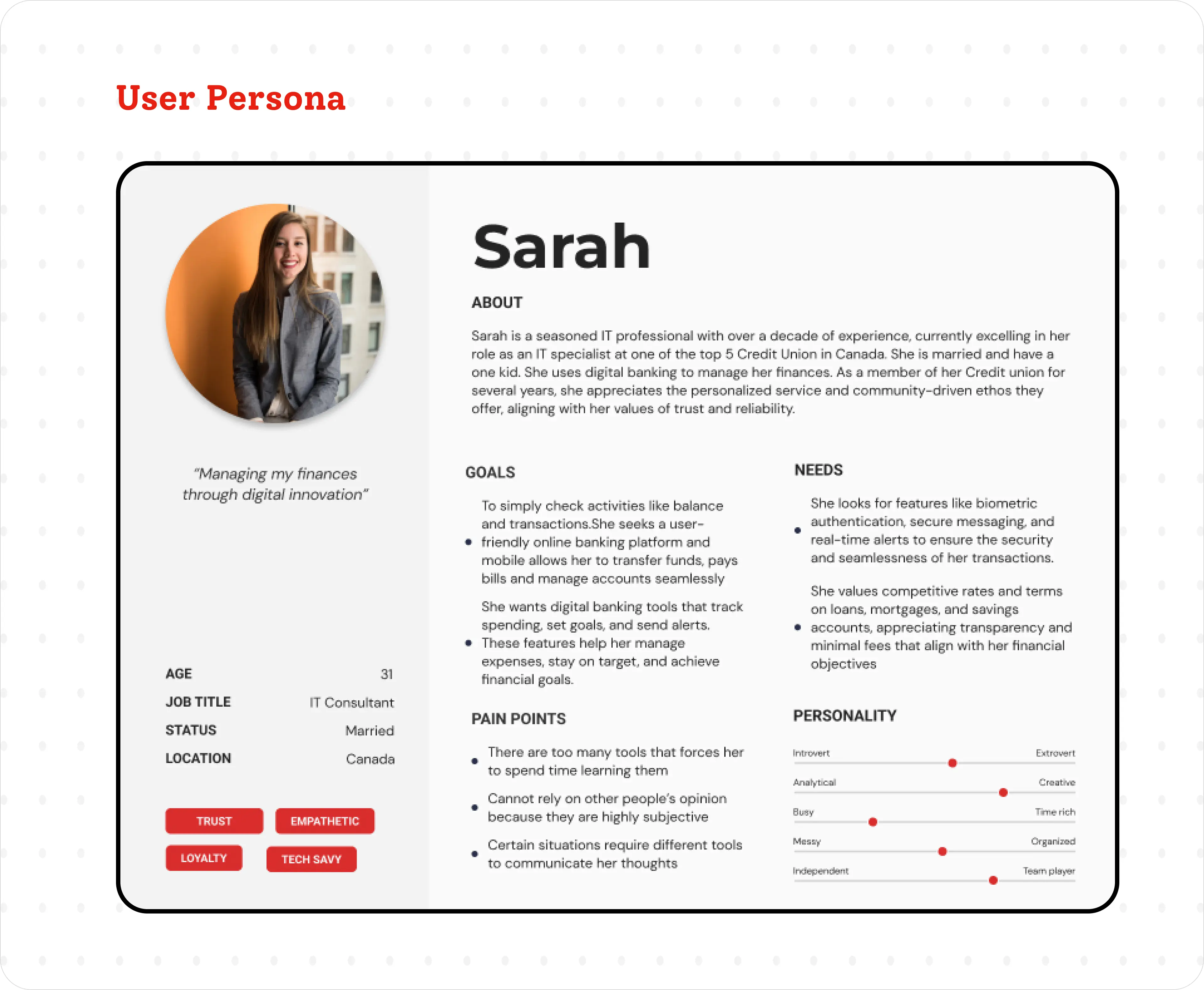
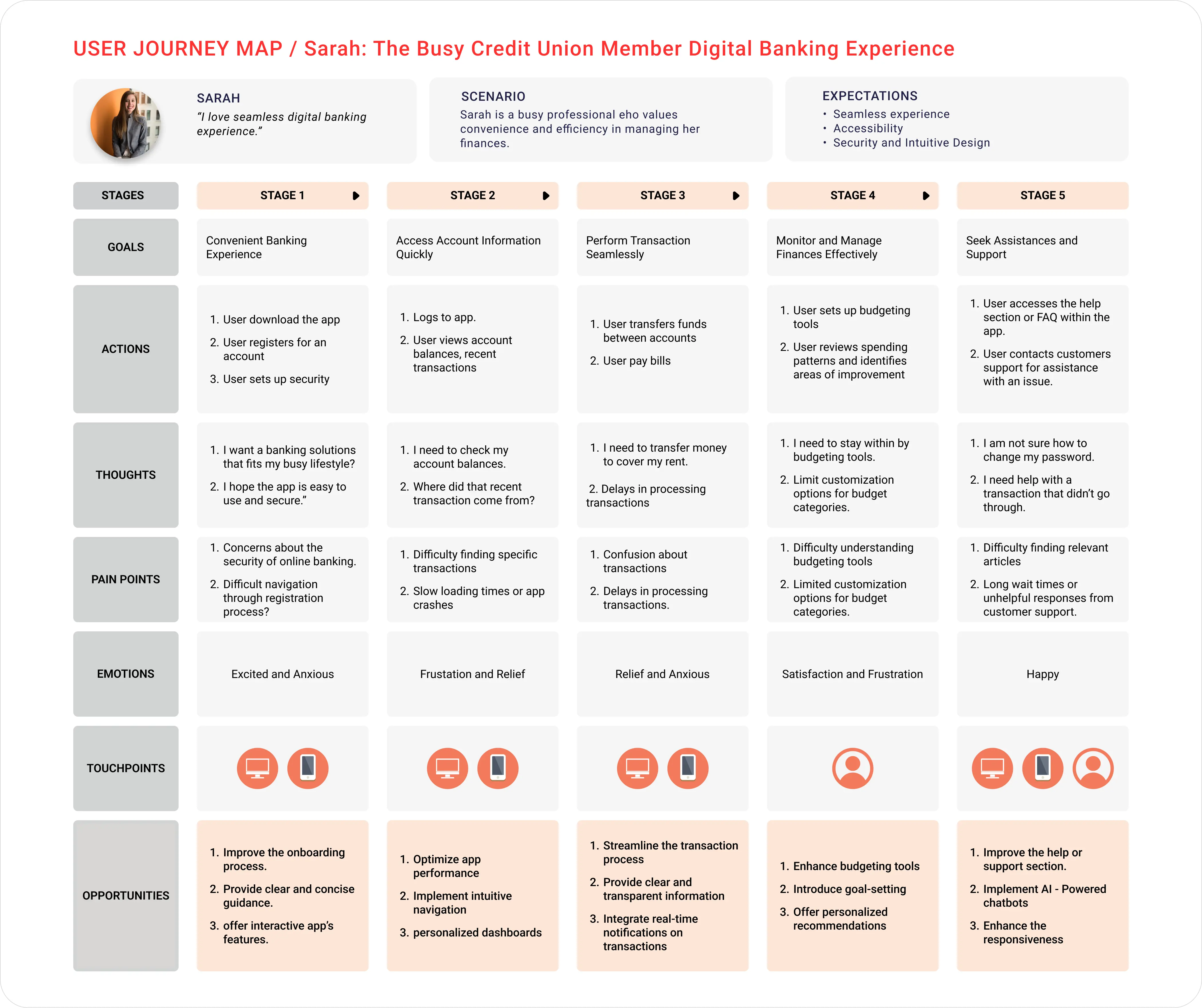
I pulled the research together into problem statements, a main persona and an end-to-end journey map. That gave the team a shared picture of who we were designing for, how they behaved and where things got frustrating.


03 · Ideate
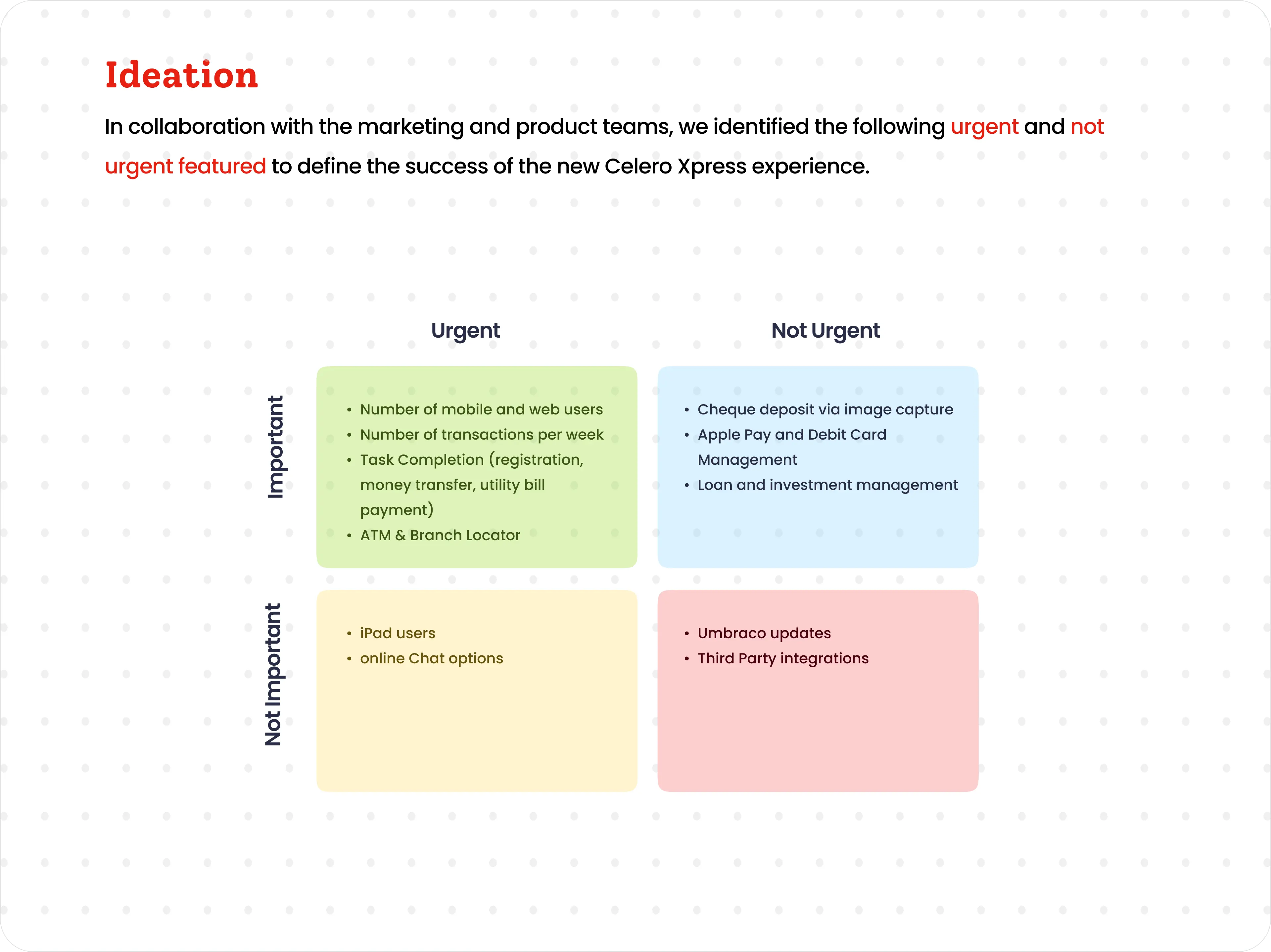
With marketing and product, I sorted features by how urgent and how important they were. That helped us agree on what success looked like for the new Xpress experience before anyone started designing screens.

04 · Design system
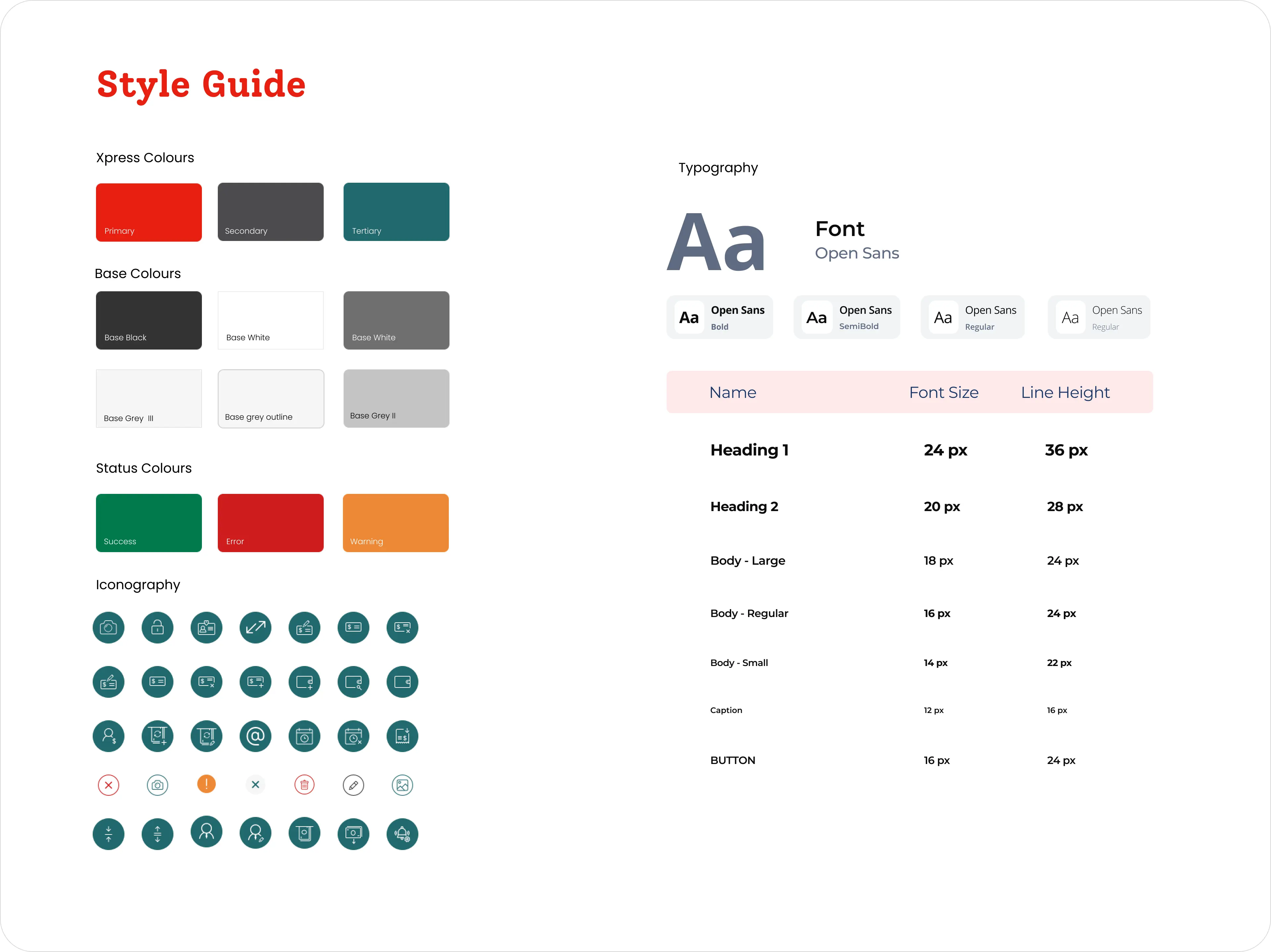
One shared, white-labelled system for colour, type and icons. Each credit union could use its own brand while every screen stayed consistent and met WCAG.

05 · The solution
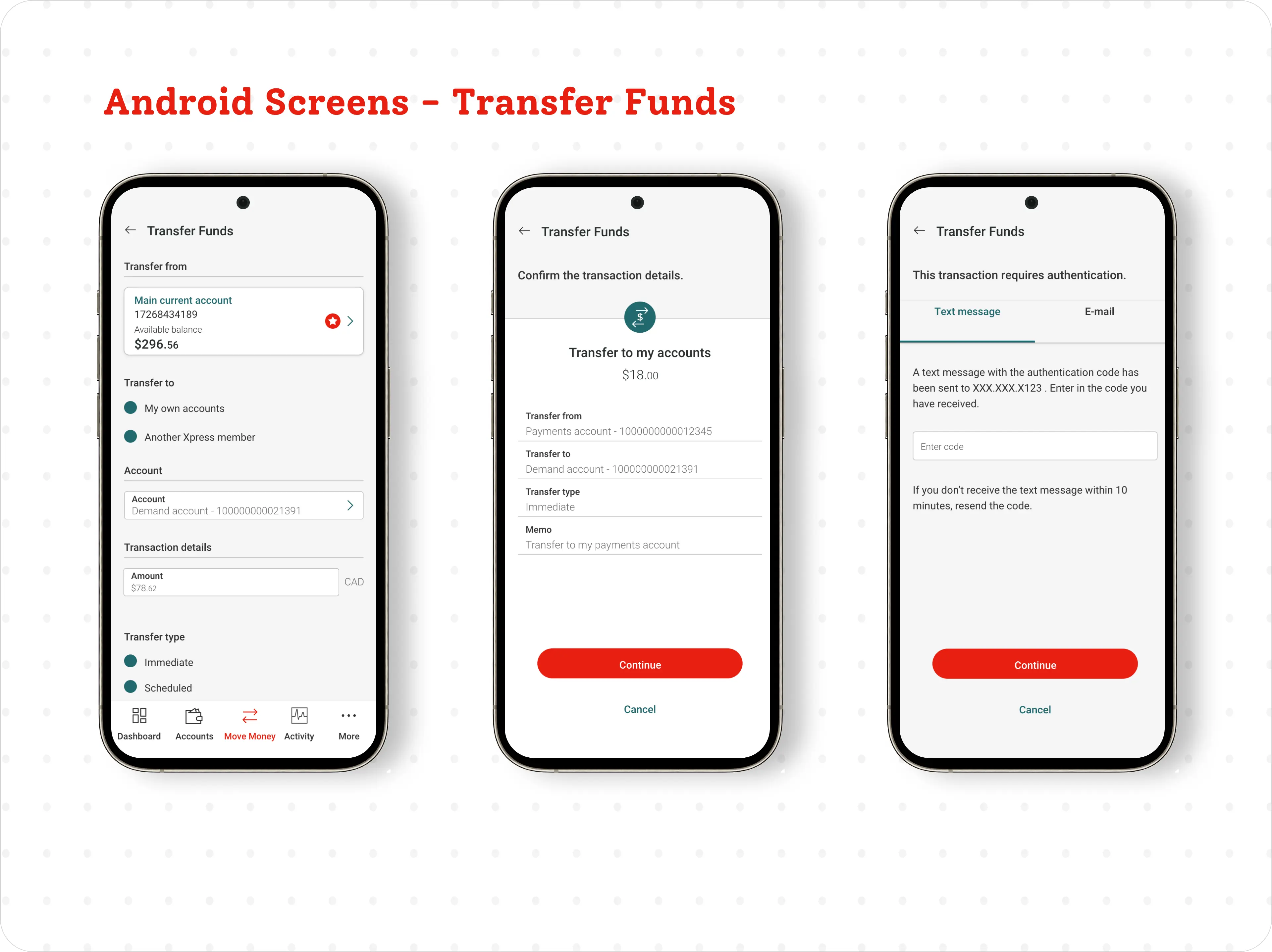
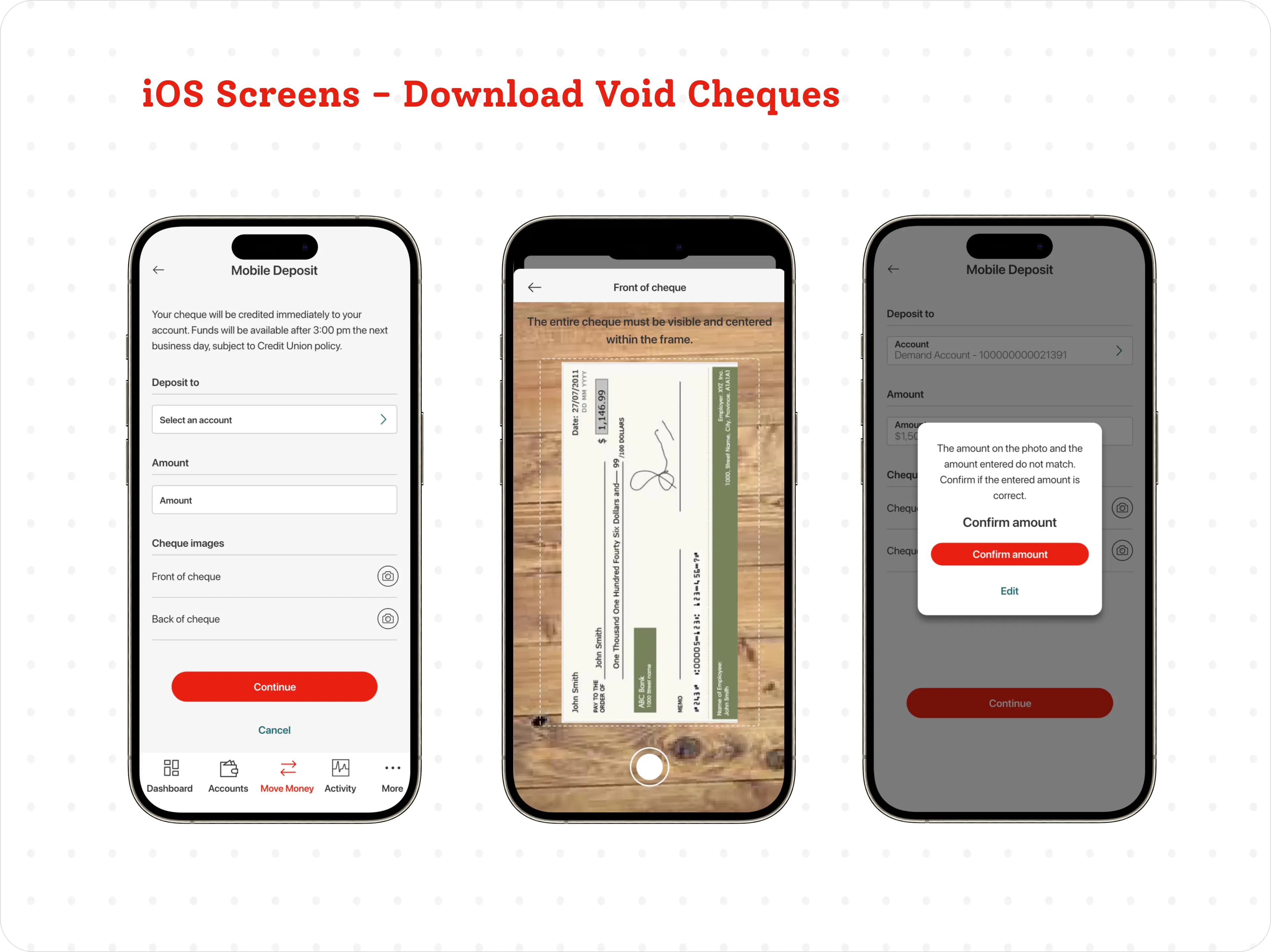
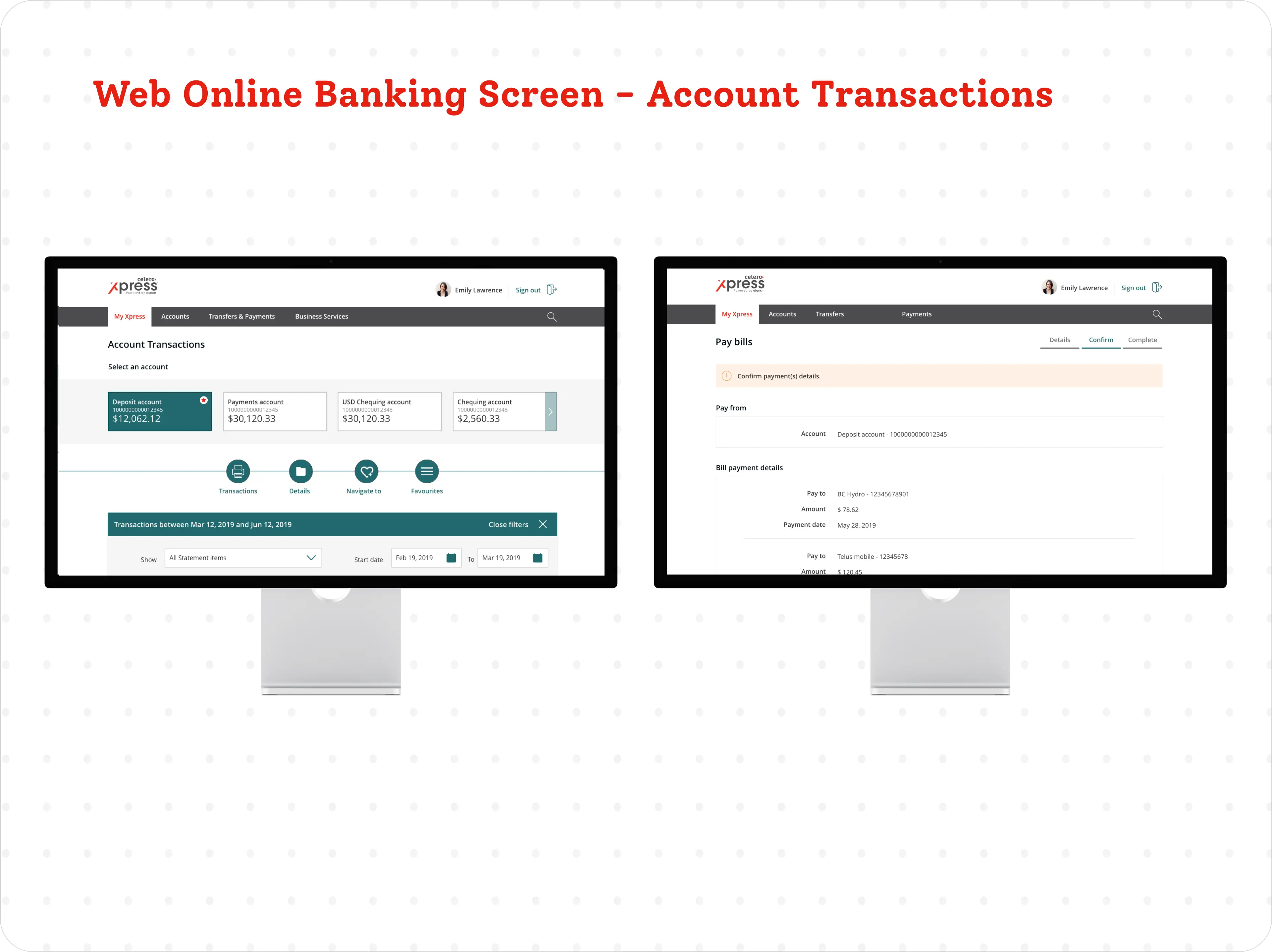
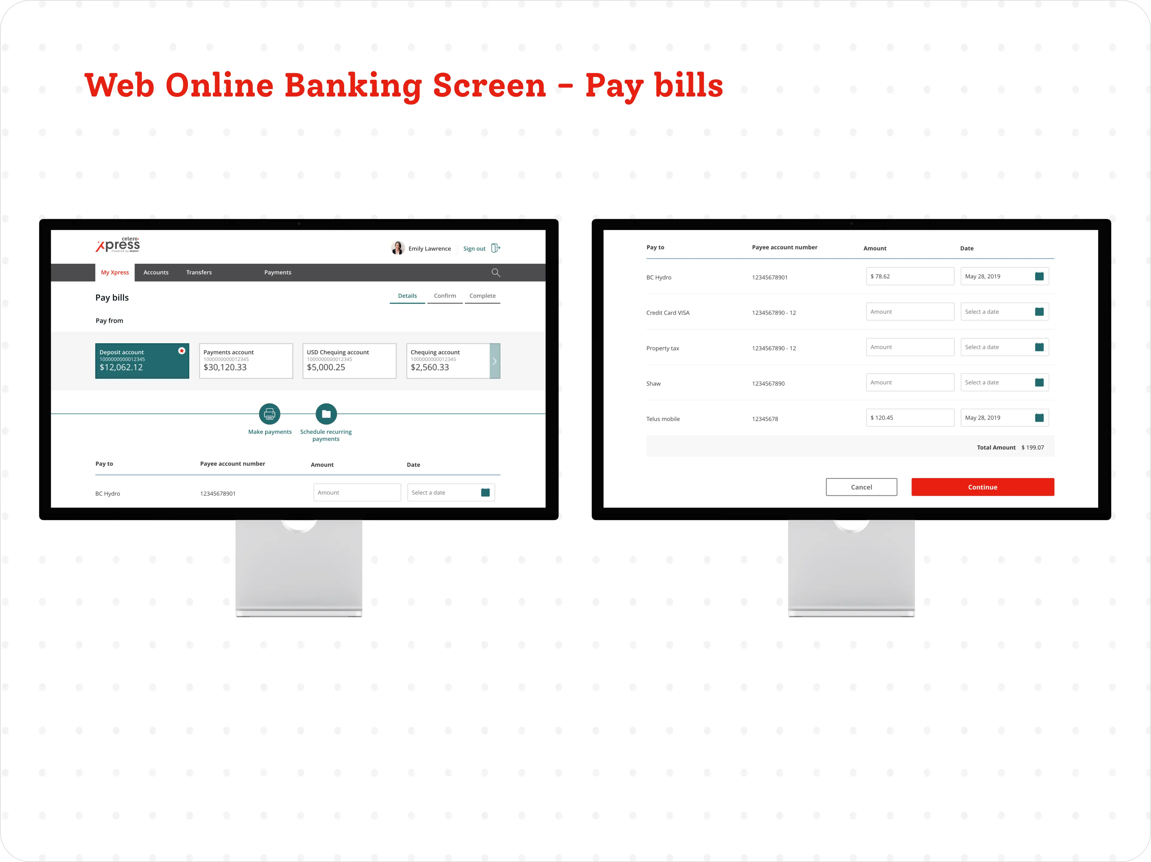
From signing in to transfers, deposits and bill payments, every flow was designed and tested for iOS, Android and the web.


Try it
This is a working version of the Android app. Every tab and button does something, and your balances update as you go.
Sign in with the fingerprint button, or any password followed by any 6-digit code. Then try paying a bill, sending an e-Transfer, moving money between accounts, or depositing a cheque. You can also search your activity and change settings under More. If you enter a cheque amount other than $1,146.99, the app warns you it doesn't match the cheque. Use "Restart prototype" under the phone to start over.
How I used AI
The original Xpress designs were static screens. To show how the app actually behaves, I used AI as a design partner to rebuild it as the working prototype above. I set the direction and made the calls; AI did the heavy lifting on code and drafts, and I reviewed every screen against the original designs.
I described each flow, from sign-in and the one-time code to transfers, bill payments and cheque deposit, and AI turned the original screens into working code. Building it this way took days, where hand-linking static screens would have taken weeks.
The design files had placeholder buttons. AI drafted plain-language wording for each one, plus error messages like "That's more than the available balance", and I edited them to match the Xpress tone.
AI generated believable accounts, balances, payees and transaction history, so the prototype feels real without using any real member data.
I asked AI to list everything that could go wrong: an empty password, a wrong code, an amount over the balance, a cheque amount that doesn't match the photo. Then I made sure each one has a clear, kind response in the app.
AI helped me check the prototype against Android patterns like back arrows, bottom sheets and Material dialogs, so it behaves the way Android users expect.
Each round, AI clicked through every flow, reported what broke, like a password field that wouldn't take typing or icons that didn't show, and fixed it. I tested the result before moving on.
The judgement stayed with me: what to build, how it should feel, and whether it was right. AI made it possible to get there in a fraction of the time.
Decisions I owned
The process above is how the work got done. These are the calls that shaped it, all agreed with the credit union stakeholders.
Every credit union wanted its own branding and its own features. I kept them on one unified design system, built with our vendor ebankit, so each could show its own brand while the screens and flows stayed shared. That's what made it possible to roll out to 30+ credit unions instead of maintaining 30 separate apps.
I argued for one design system over separate builds, and then helped each credit union through its rollout so the shared system actually got adopted, not just approved.
Every credit union had to meet accessibility standards. I led the accessibility work on Xpress: I designed accessible UI into the shared components and added screen reader support across the app, so each credit union got a compliant experience through the same system.
Why I made these calls
Most of the work above came down to a handful of choices. Here's what I chose and why.
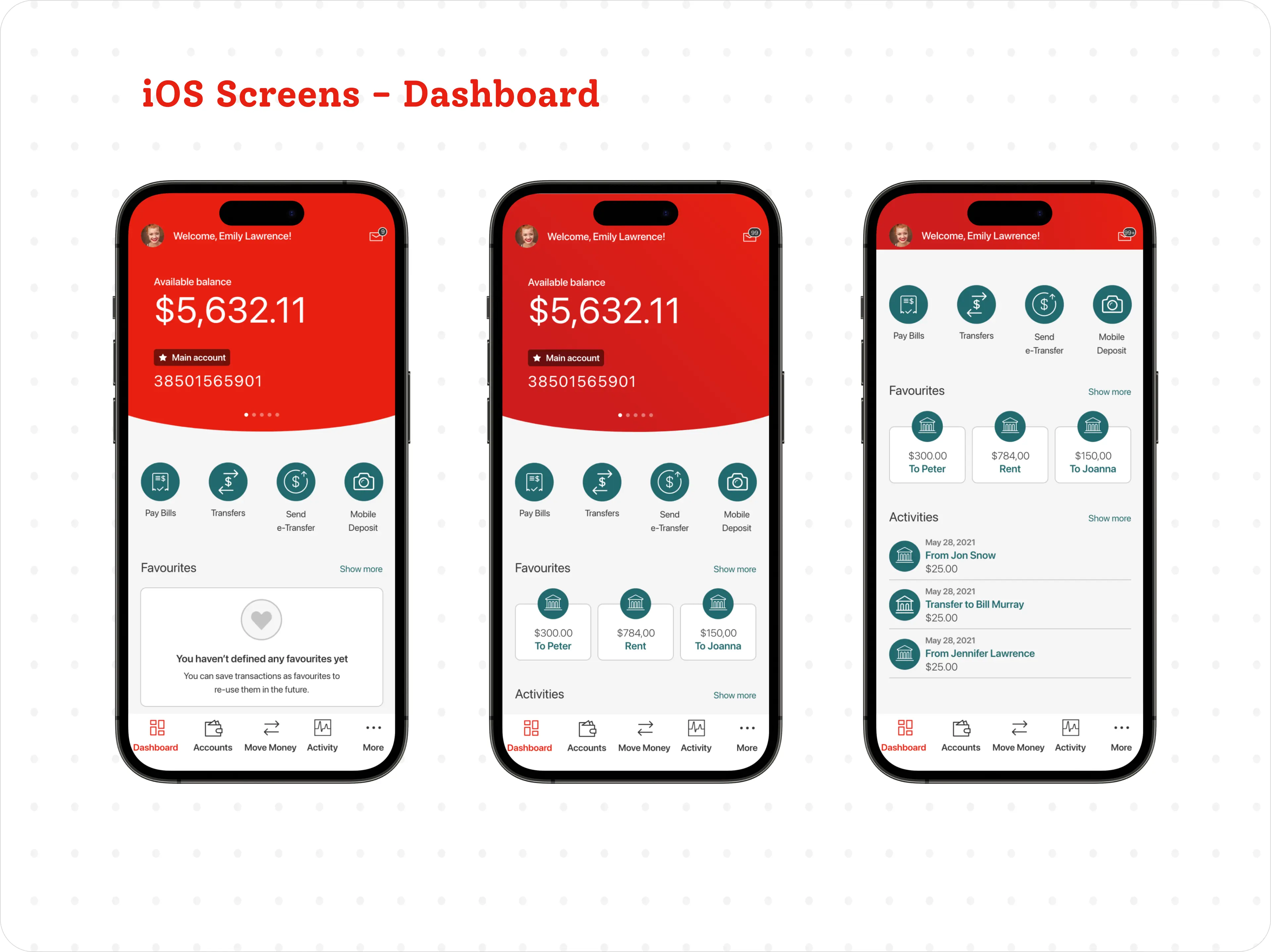
Research showed members open the app to do four things: pay a bill, transfer, send an e-Transfer or deposit a cheque. Hiding those in a menu added taps to every visit, so they went straight onto the dashboard.
Thirty credit unions each wanted their own brand. Separate designs would have drifted apart and been impossible to maintain. A white-labelled system with swappable colour and logo gave each one its look while the screens stayed the same.
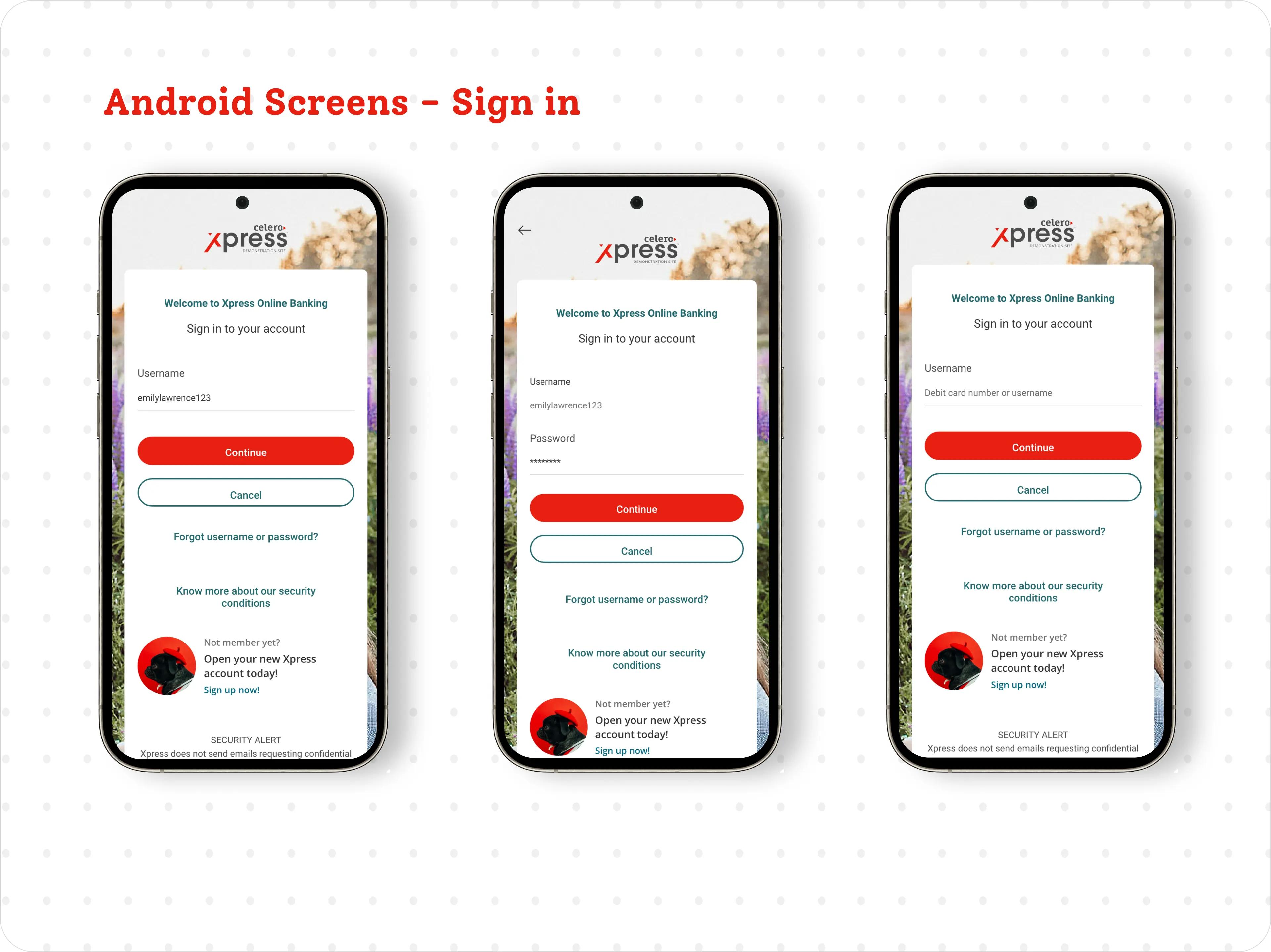
Members saw one-time codes as the bank getting in the way. Saying why the code was needed, and falling back calmly when fingerprint failed, turned a frustrating step into one that felt protective.
Support calls came from blurry cheque photos, wrong amounts, empty lists and lost connections, not from the main flow. Designing those moments first meant fewer members got stuck and fewer called in.
A mistake with money is stressful and slow to undo. A clear review screen before every transfer and deposit costs one tap, and it lets members catch errors while they can still fix them.
Changes are cheap when they're still sketches. Running 40+ interviews and usability sessions while the design was still forming meant problems got fixed before they were built.
Testing & impact
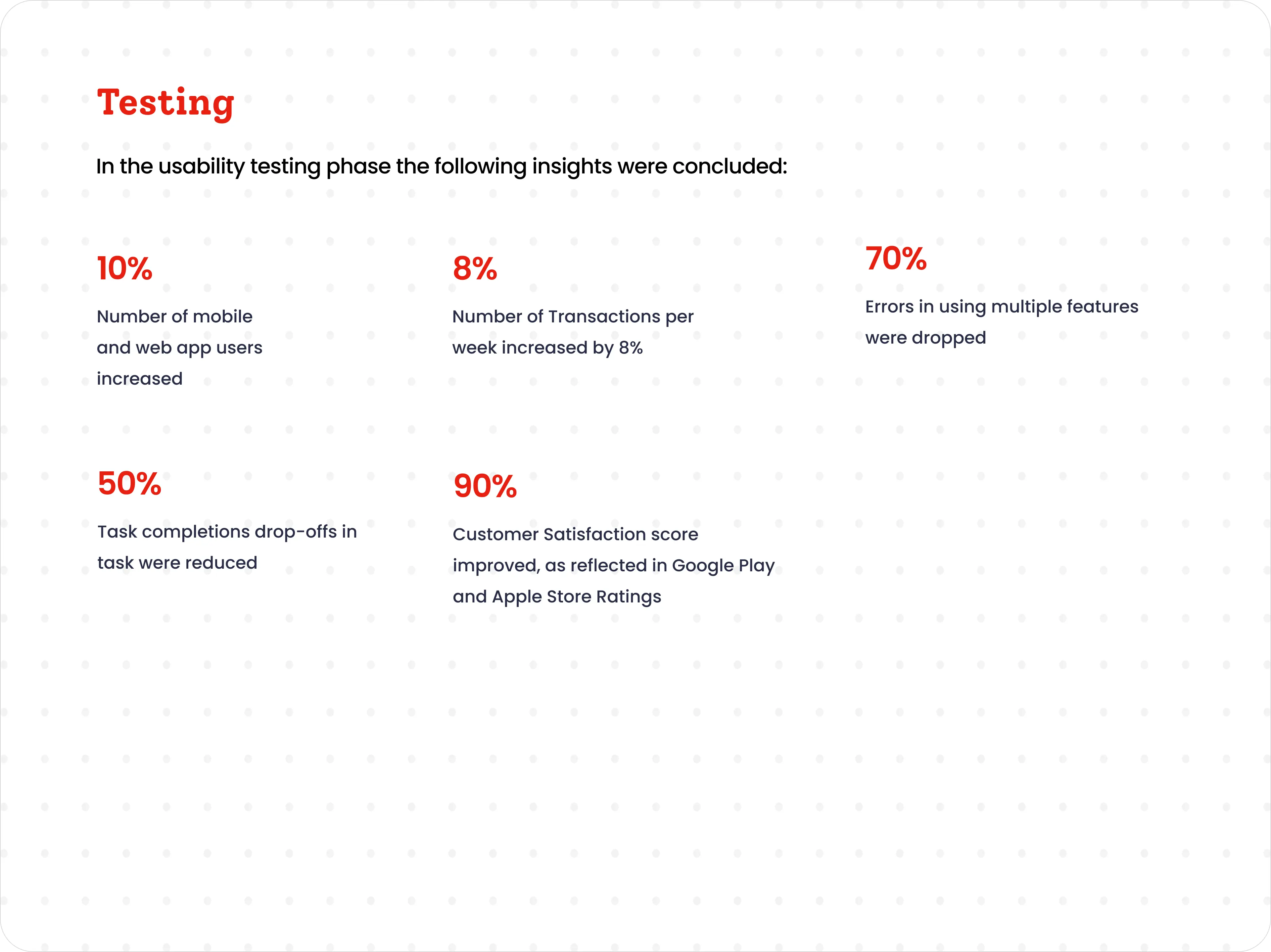
Usability testing with the pilot groups showed the redesign made banking faster, clearer and easier to pick up.

Key takeaways

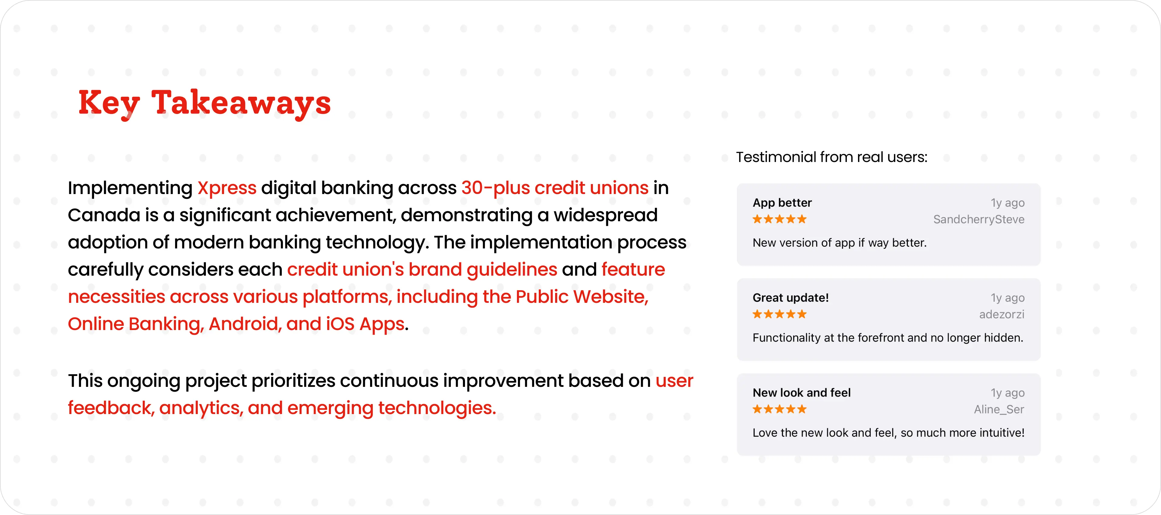
Functionality at the forefront and no longer hidden. Love the new look and feel — so much more intuitive.— App-store reviews from Xpress members
Looking back
When I worked on Xpress, AI wasn't part of our design workflow yet. Looking back, a lot of the slow, repetitive work is exactly where it helps most. Banking data is sensitive, so the rule would be simple: no real member data goes in. Made-up data, design files and public guidelines are fine.
None of this replaces talking to members or the judgement calls a designer makes. It clears away the busywork so more time goes into the parts that need a person.
Looking ahead
Banks and credit unions answer to regulators, auditors and their members, so they can't adopt AI the way a startup might. The opportunity is real, but only if every use is explainable, reviewed by a person and safe with member data. These are the places I see it helping most, and the guardrails each one needs.
An assistant can answer everyday questions like "When will my deposit clear?" or "How do I reset my password?" around the clock. It should say clearly that it's AI, never give financial advice, and pass the conversation to a person, with the context attached, the moment it's unsure or the topic is sensitive.
AI can flag patterns a person would miss, like a new payee followed by a large e-Transfer at 2 am. The design job is the alert: tell the member what looked unusual, let them confirm or block it in one tap, and keep a person in charge of freezing accounts.
Fees, holds, term deposit rates and loan terms are full of jargon. AI can explain them in plain words on demand, as long as the wording comes from approved content and the official terms are always one tap away.
Before a release, AI can check screens and copy against required disclosures, accessibility rules and the brand guide, and list what's missing. Compliance still signs off, but they start from a checklist instead of a blank page.
Reading a cheque, a pay stub or ID and pre-filling the form saves members typing and cuts errors. The member reviews every pre-filled field, and anything the AI isn't confident about is flagged rather than guessed.
Thousands of call notes, chats and app reviews can be grouped into themes, with names removed, so product teams see what's frustrating members this week, not next quarter.
Designed this way, AI makes banking faster and clearer without losing the trust that credit unions are built on.